20 Univariate statistics
In this chapter, we will focus on exploratory data analysis of a single variable. We discuss the features of a continuous variable and how these features can be explored, elucidated, tested, and visualised. We then discuss ordinal and nominal categorical variables and the various considerations when exploring these types of variables.
20.1 Continuous variables
A continuous variable is a type of variable that can take on any value within a given range. It’s characterised by the ability to be measured and can have an infinite number of values between any two given points. Examples include height, weight, temperature, and time.
20.1.1 Measure of central tendency
In statistics, measure of central tendency is a central or typical value for a probability distribution. Most common measures are mean, median, and mode but there are many other measures of central tendency. It is important to note that not all measures of central tendency are robust.
Mean
Mean is the sum of a set of values divided by the number of values. Mathematically, it is represented as:
\[ \bar{x} ~ = ~ \sum_{i=1}^{n} x_i \times \frac{1}{n} \]
Mean is a non-robust measure of location because it is susceptible/sensitive to a few extreme values in the data.
Median
For a dataset \(x\) of \(n\) elements ordered from smallest to greatest, if \(n\) is odd
\[ \tilde{x} ~ = ~ x_{(n + 1)/2} \]
and if \(n\) is even
\[ \tilde{x} ~ = ~ \frac{x_{\frac{n}{2}} + x_{\frac{n}{2} + 1}}{2} \]
The median is the value that divides a dataset into two equal halves, separating the higher half from the lower half. It can be seen as the ‘middle’ value in a data sample, population, or probability distribution. Unlike the mean (often referred to as the “average”), the median is not influenced by extremely large or small values, making it more resistant to skewed data and providing a better representation of the dataset’s center.
For instance, when analysing income distribution, the median income is often a more accurate measure of the central tendency because increases in the highest incomes do not affect the median. This characteristic makes the median particularly valuable in robust statistics, where its ability to withstand the impact of outliers is highly regarded.
Note 20.1: Mean vs Median
Consider this data of test scores of ten students.
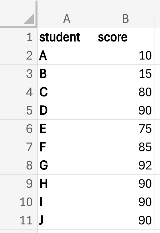
8 out of the 10 students did really well with scores 75 and higher but two students got really low scores.
Calculating the mean scores using the spreadsheet, we use the AVERAGE() function:
=AVERAGE(B2:B11)we get 71.7.
Calculating the median scores using the spreadsheet, we use the MEDIAN() function:
=MEDIAN(B2:B11)we get 87.5.
The mean and the median can be very different from each other.
If median > mean, this would indicate that the continuous variable has some extremely low values
If median < mean, this would indicate that the continuous variable has some extremely high values
We should be using median instead of mean when performing summary measures for continuous variables
20.1.2 Measure of dispersion
In statistics, measure of dispersion describes the spread or variability of data points within a dataset. It indicates how much individual values deviate from the central tendency. Essentially, it provides insight into whether the data is tightly or loosely clustered around its center. Common measures of dispersion include variance, standard deviation (SD), and interquartile range (IQR).
Standard deviation and variance are the most popular choice for measure of dispersion but are not robust to extreme values or outliers.
Standard deviation
\[ sd ~ = ~ \sqrt{\sum_{i=1}^n \frac{(x_i - \bar{x}) ^ 2}{n - 1}} \]
where:
\(n ~ = ~ \text{number of observations in sample}\)
\(x_i ~ = ~ \text{individual data point}\)
\(\bar{x} ~ = ~ \text{sample mean}\)
In Excel, you can calculate standard deviation using the STDEV() function. Using the student scores example:
=STDEV(B2:B11)which gives 31.6756128.
A low standard deviation indicates that the values tend to be close to the mean of the set, while a high standard deviation indicates that the values are spread out over a wider range. The standard deviation is commonly used in the determination of what constitutes an outlier and what does not.
Interquartile range (IQR)
IQR is the difference between the 1st and 3rd quartile of the values of the continuous variable and is a more robust measure of spread.
Excel doesn’t have a function to calculate IQR but it can be calculated with the QUARTILE() function. Using the student scores example:
=QUARTILE(B2:B11, 3) - QUARTILE(B2:B11, 1)which gives 13.75.
20.1.3 Distribution
Assessing distribution using boxplots
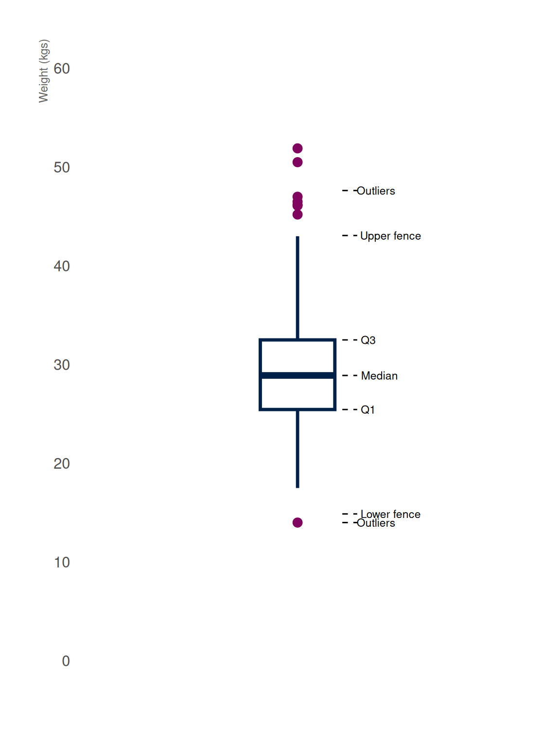
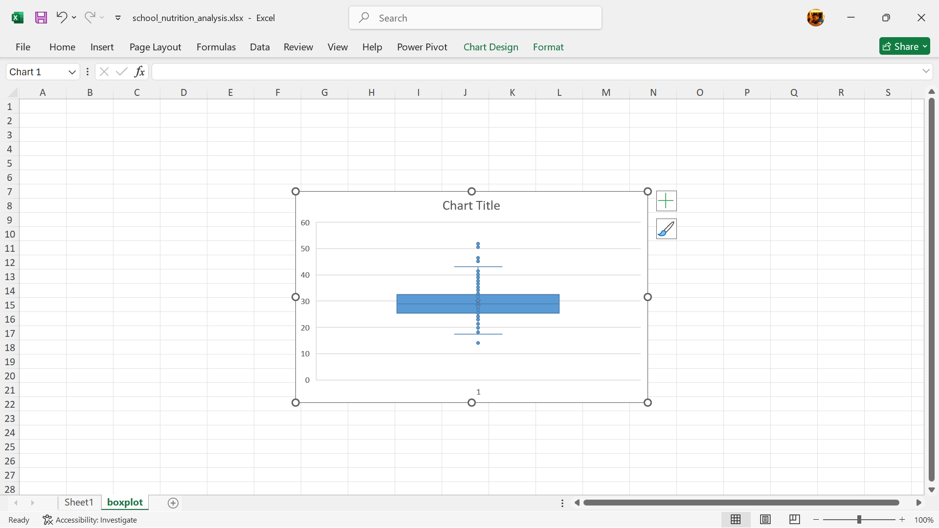
A boxplot, also referred to as a box-and-whisker plot, is a graphical tool used to summarise the distribution of a continuous variable. It provides insights into key aspects such as the median, quartiles, and any potential outliers in a clear and concise manner.
Key Components of a Boxplot
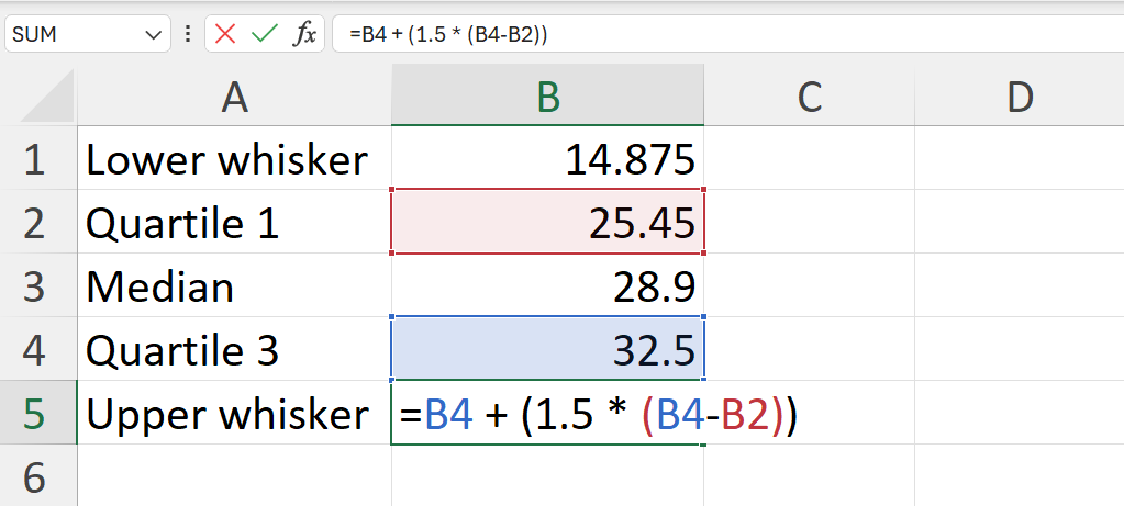
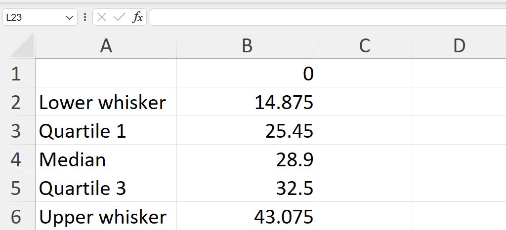
The Box: The box itself illustrates the IQR, which spans the middle 50% of the data. The lower edge of the box represents the first quartile (25th percentile), while the upper edge marks the third quartile (75th percentile).
The Median Line: A vertical line within the box indicates the median, or the 50th percentile, which divides the dataset into two equal halves.
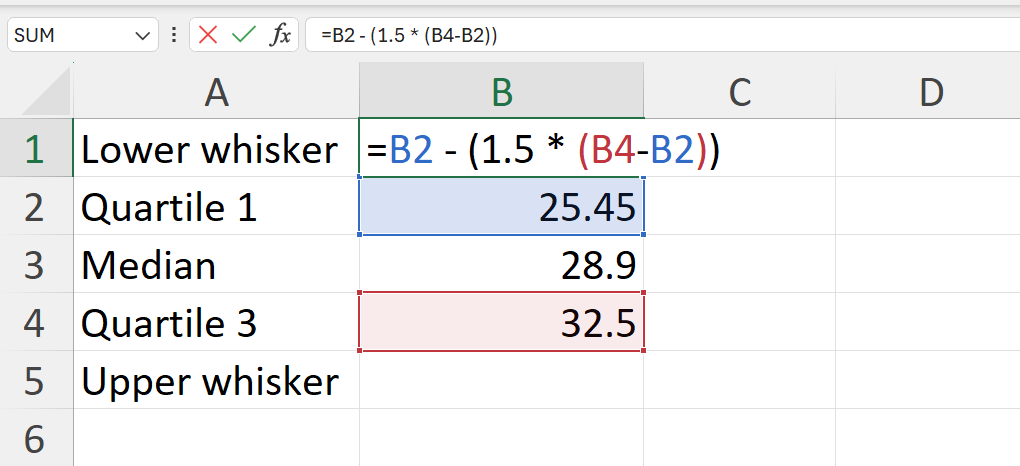
The Whiskers: Lines extending from the sides of the box, often referred to as whiskers, show the range of the data beyond the IQR. This is based on 1.5 times the IQR value. The lower whisker is measured out as a distance 1.5 times IQR below the lower edge of the box (lower quartile) while the upper whisker is measured out as a distance 1.5 times IQR above the upper edge of the box (upper quartile).
Outliers: Data points that lie outside the whiskers are considered outliers and are usually plotted as individual points separate from the main plot.
Plotting boxplots
Starting with Excel 2016, Microsoft has included a Box and Whiskers chart capability to Excel.
- Go to
Insert–>Insert Statistics Chart–>Box and Whisker
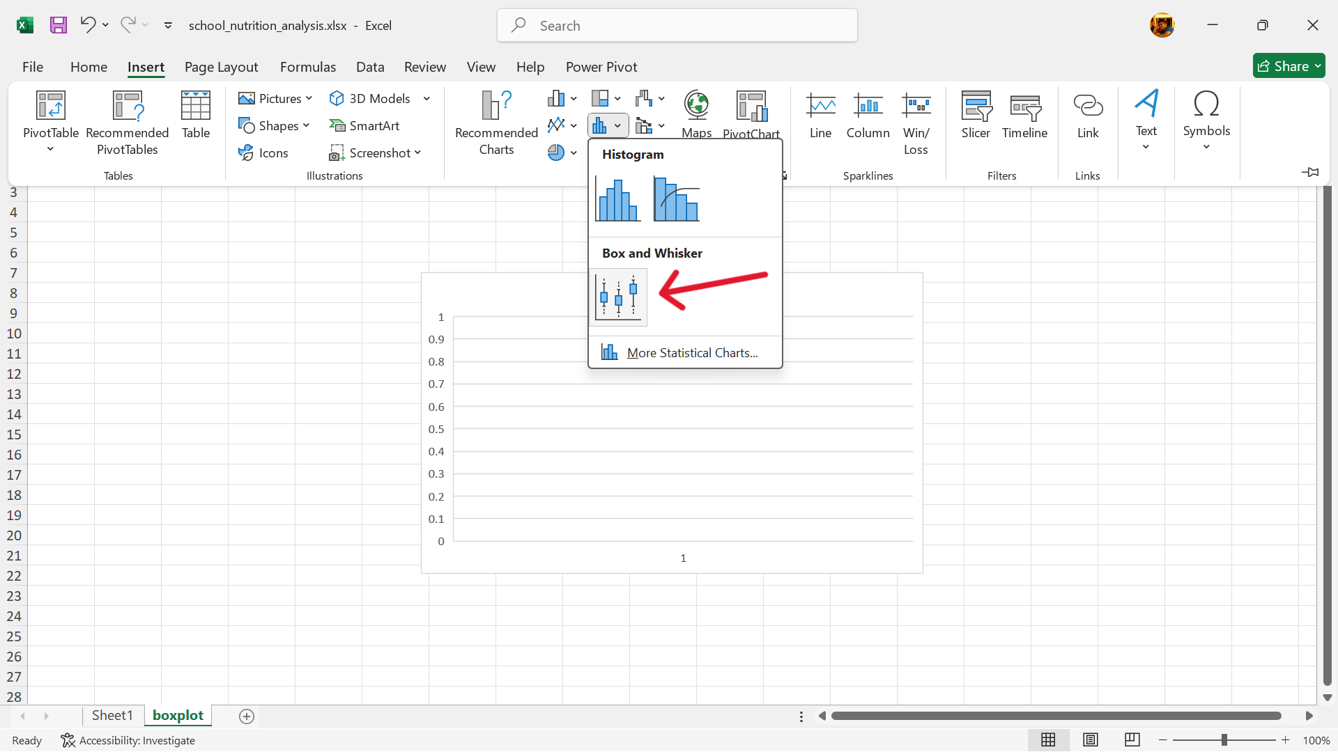
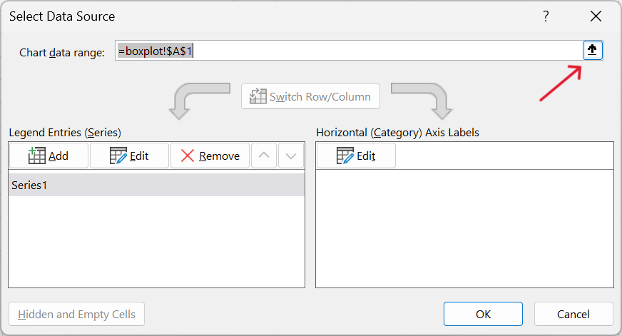
- Select base chart –>
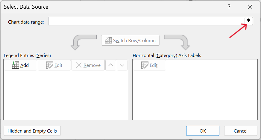
Chart Design–>Select Data
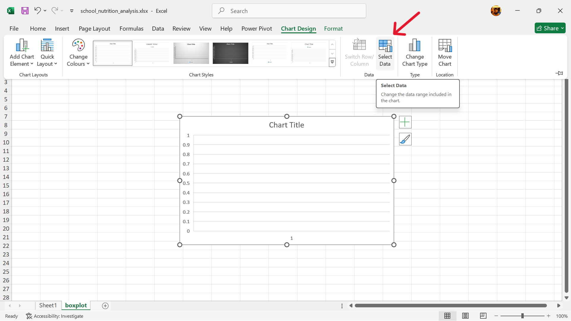
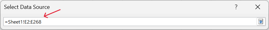
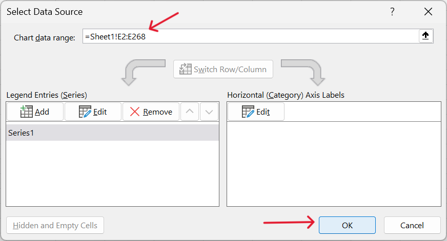
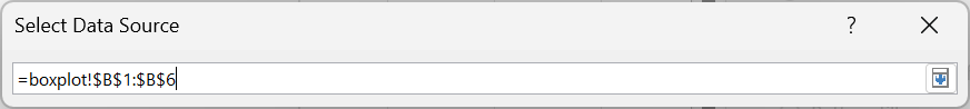
- Edit range of values to use for boxplot.
- Specify range of weight values for boxplot.
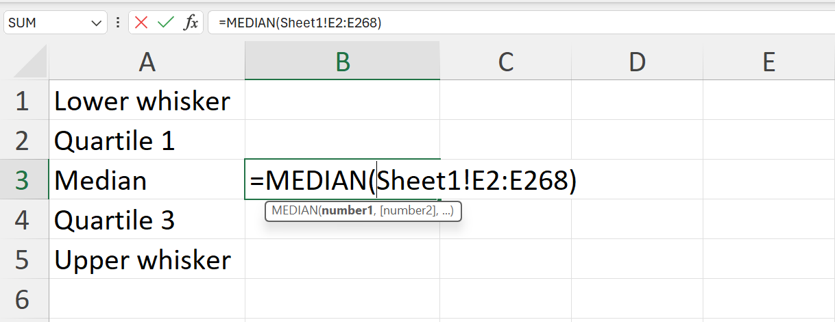
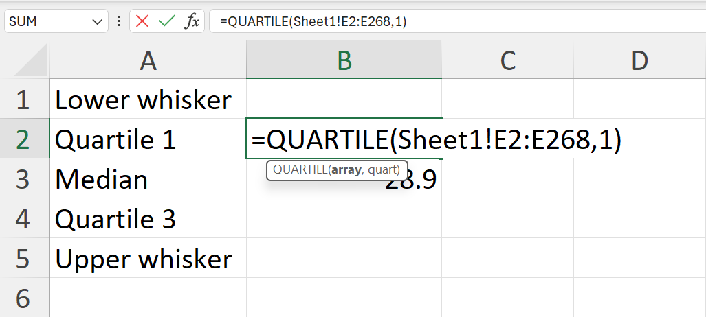
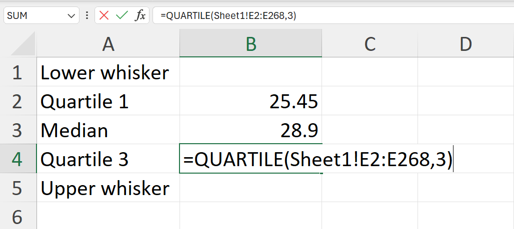
The data is in Sheet 1 and found in range E2:E268.
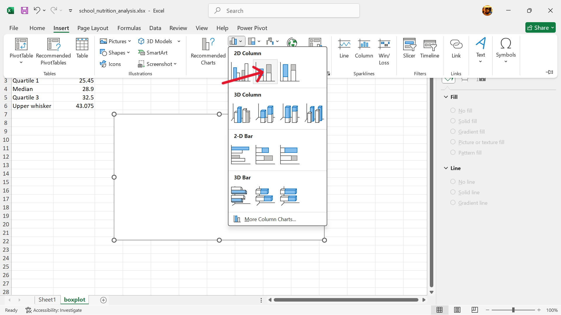
Before Excel 2016 version, there was no boxplot chart type available but boxplots can be made through the following steps:
- Calculate the lower whisker, quartile 1, median, quartile 3, and upper whisker summary values of the weight variable.
- Create a base stacked column chart.
Insert –> Insert Column or Bar Chart –> Stacked Column
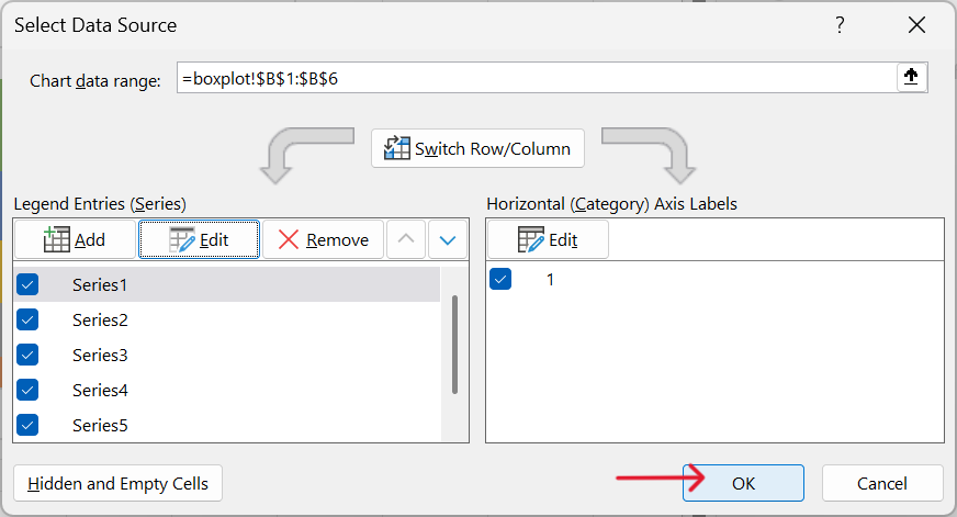
- Select data to use for stacked column chart.
Select base chart –> Chart Design –> Select Data
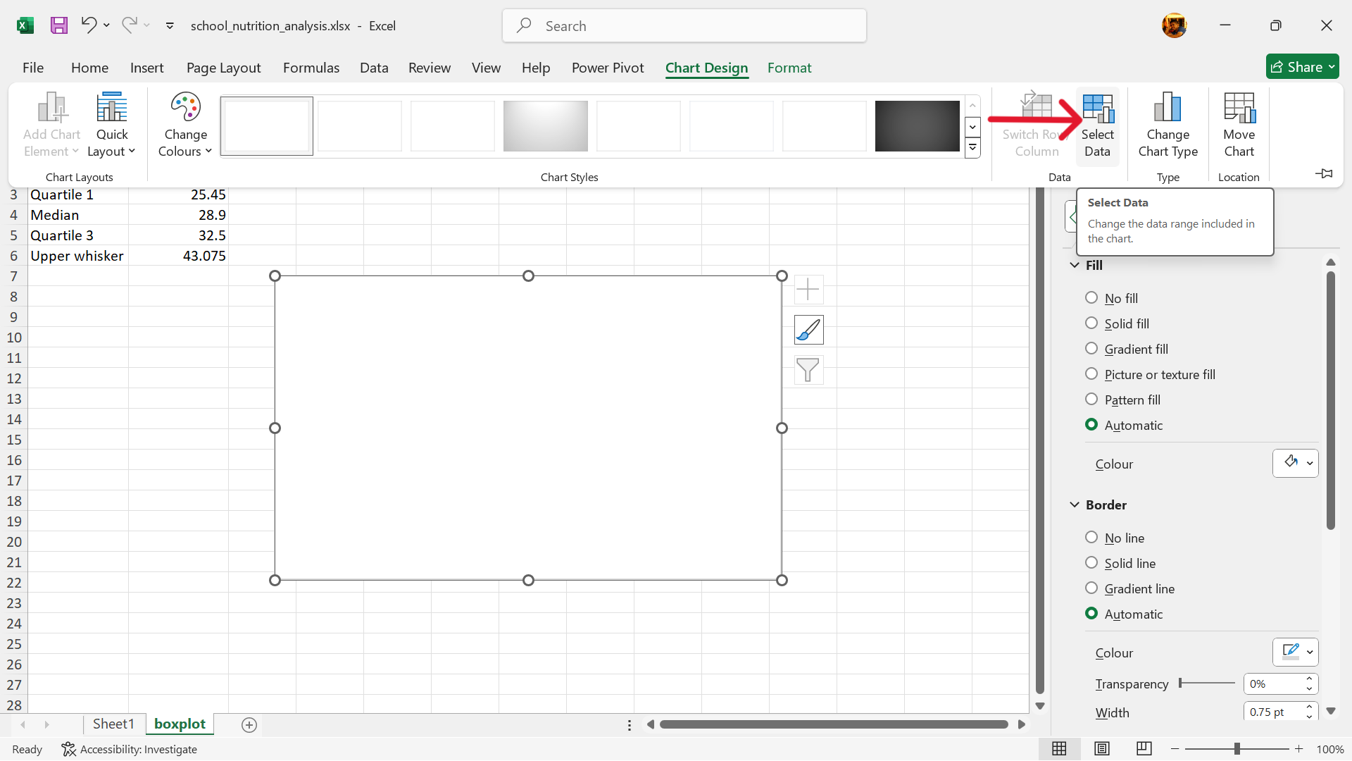
- Edit range of values to use for stacked column chart.
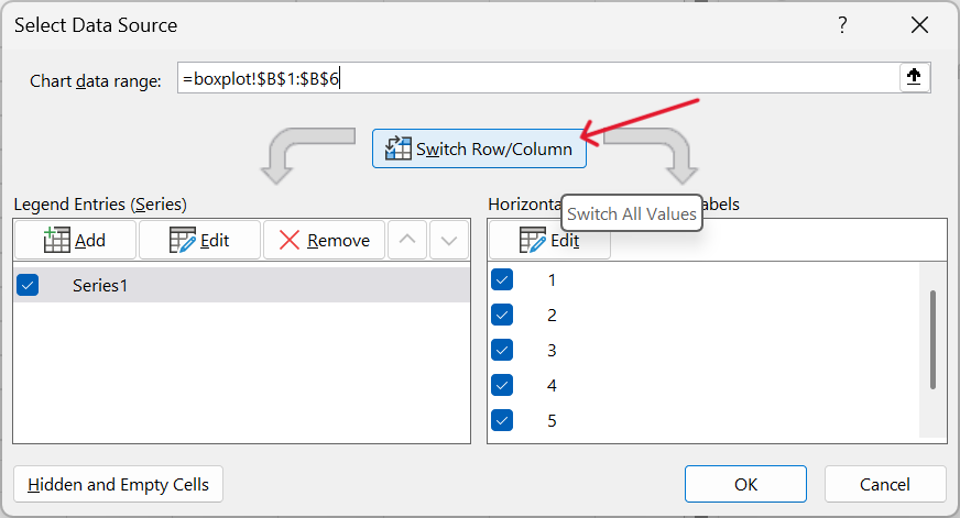
- Reverse stacked column chart axis.
Click on Switch Row/Column
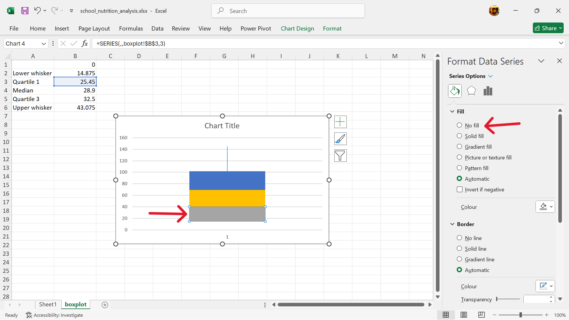
- Hide the lower column of the stacked column chart.
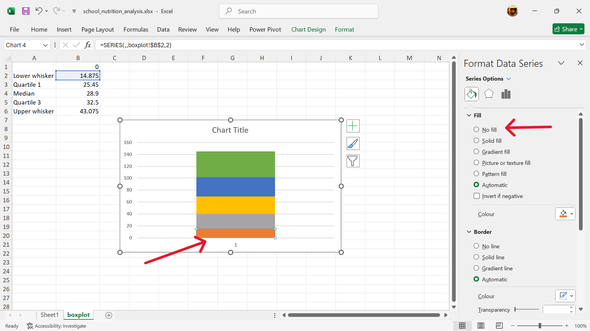
Click on the lower column of the stacked column chart. Format the data series by removing its fill.
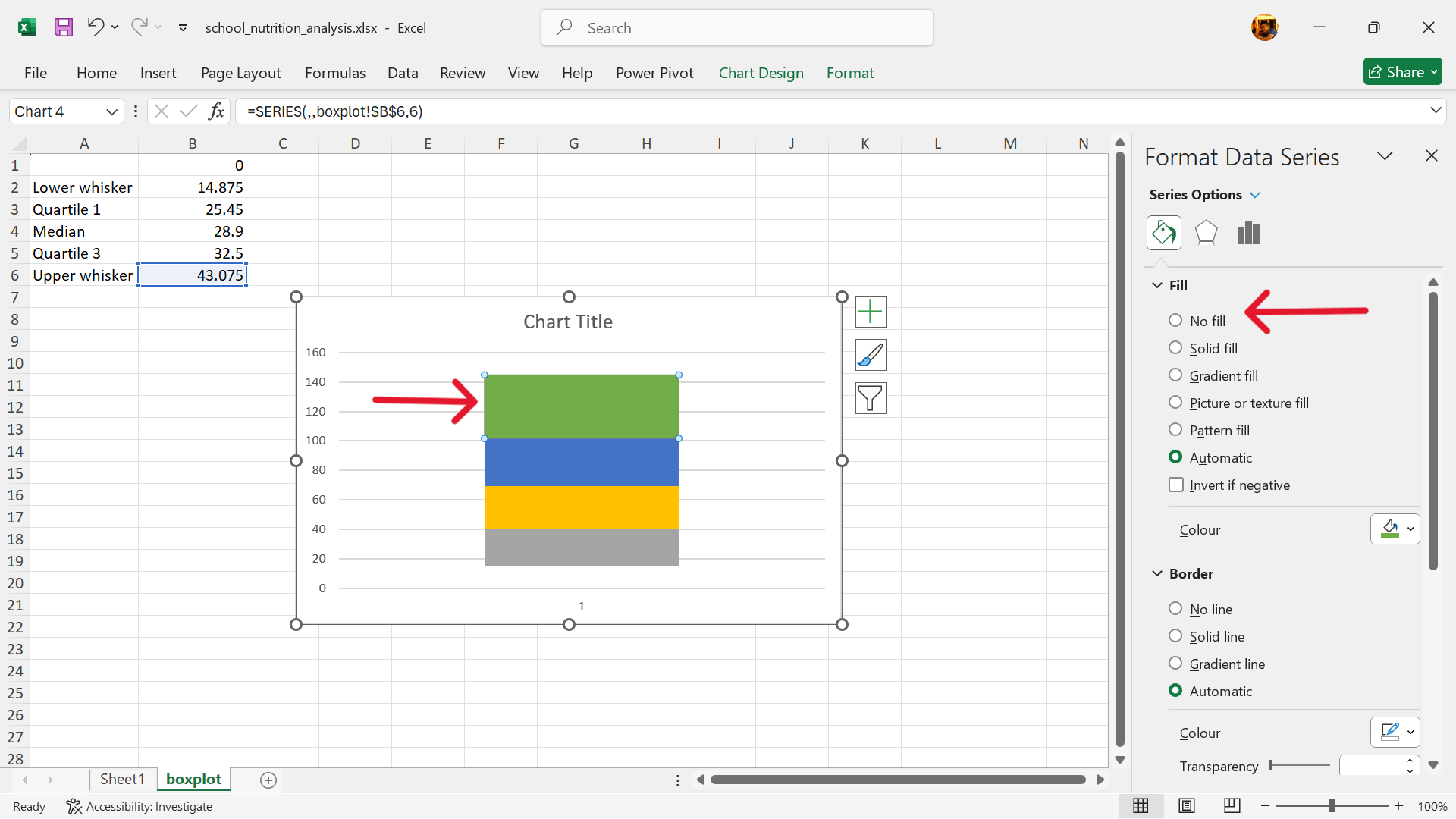
- Hide the upper column of the stacked column chart.
Click on the upper column of the stacked column chart. Format the data series by removing its fill.
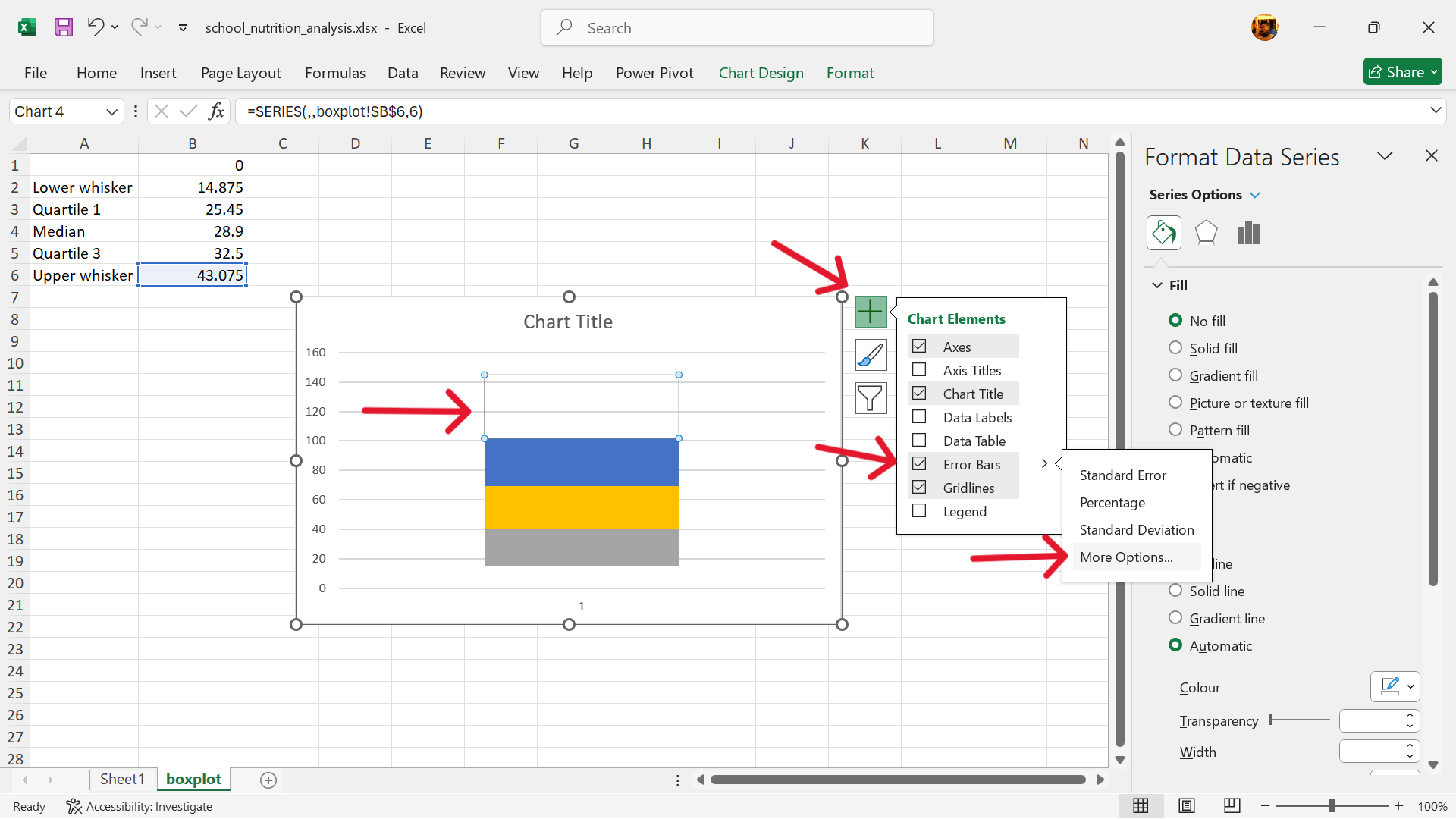
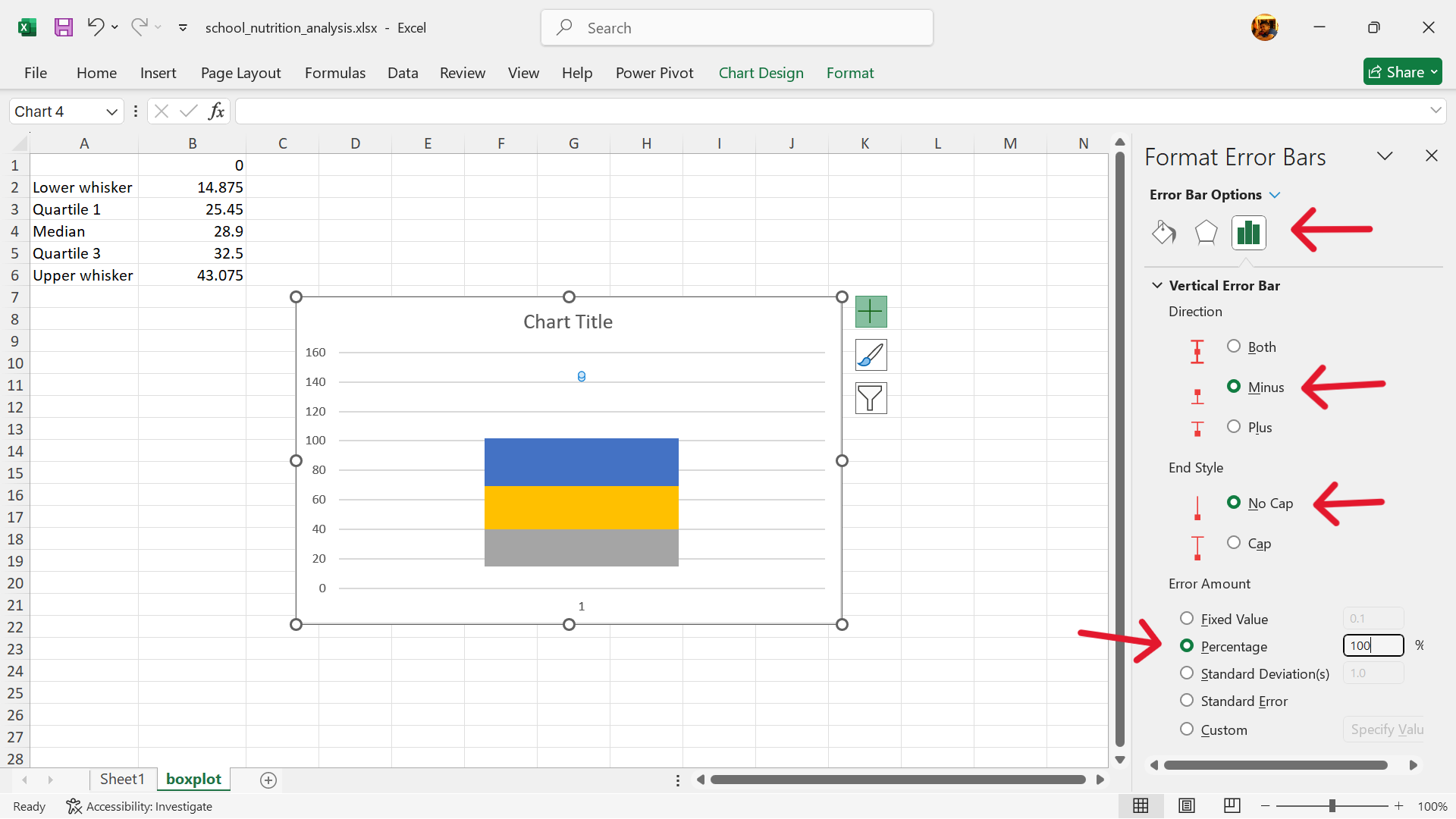
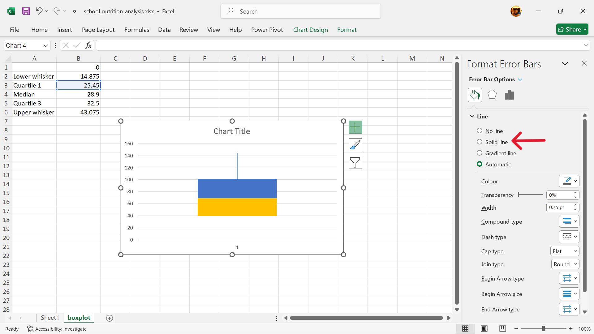
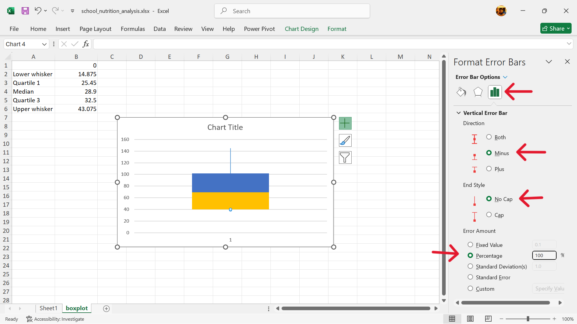
- Add error bars to replace the upper column.
Click on Chart Elements –> Error Bars –> More Options
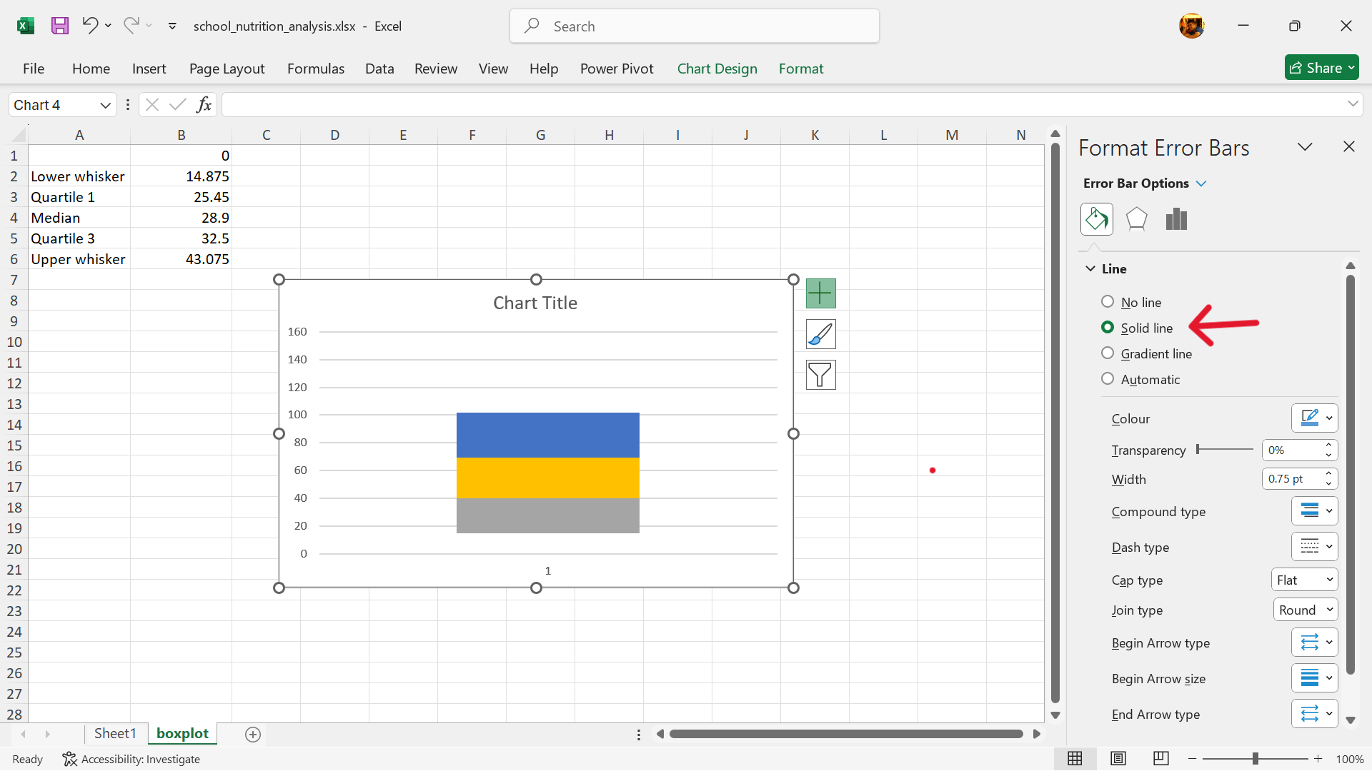
- Format error bars to create the upper whisker.
- Hide the second lower column of the stacked column chart.
Click on the second lower column of the stacked column chart. Format the data series by removing its fill.
- Add error bars to replace the second lower column.
Click on Chart Elements –> Error Bars –> More Options
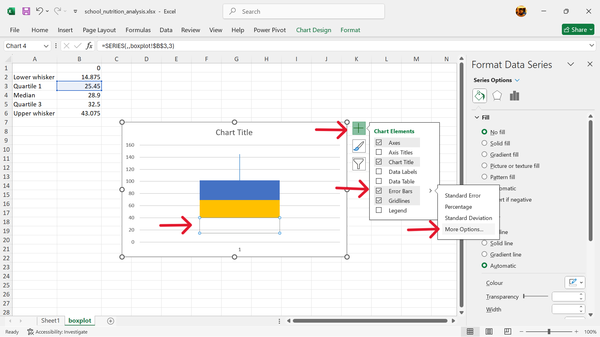
- Format error bars to create the lower whisker.
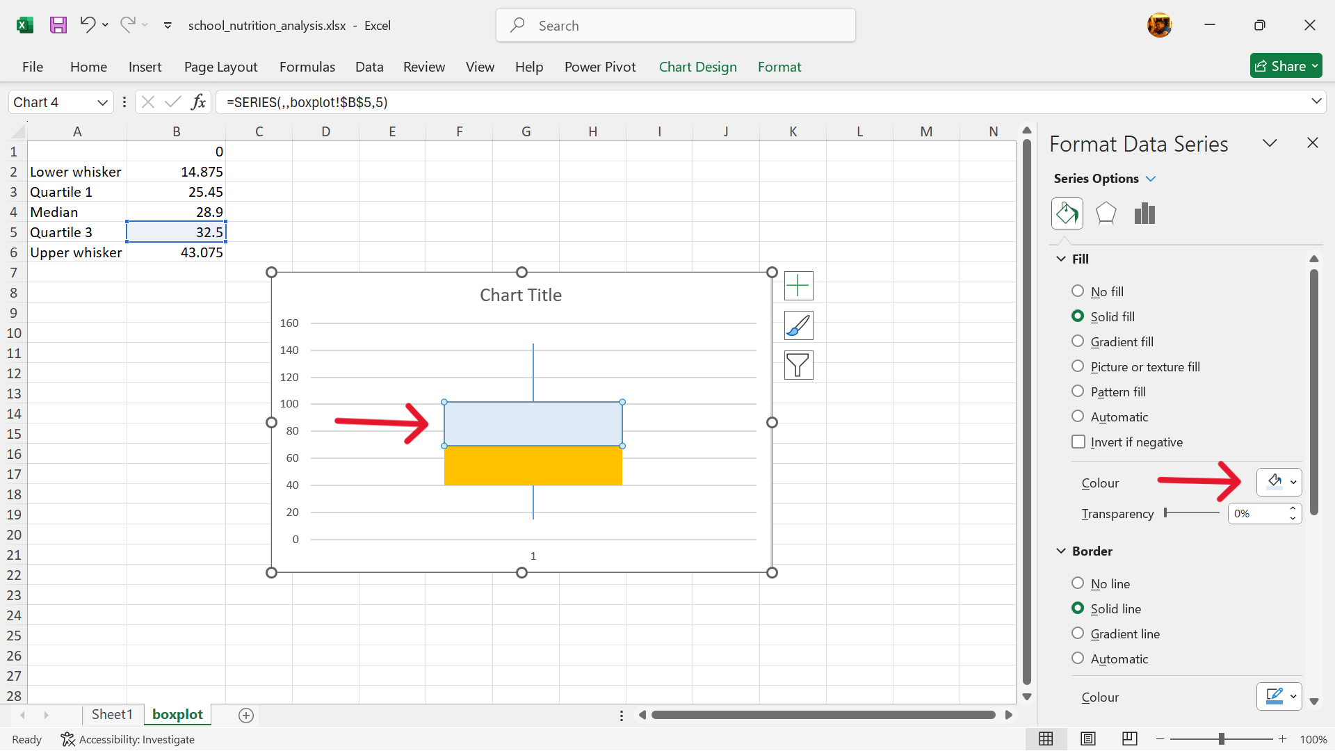
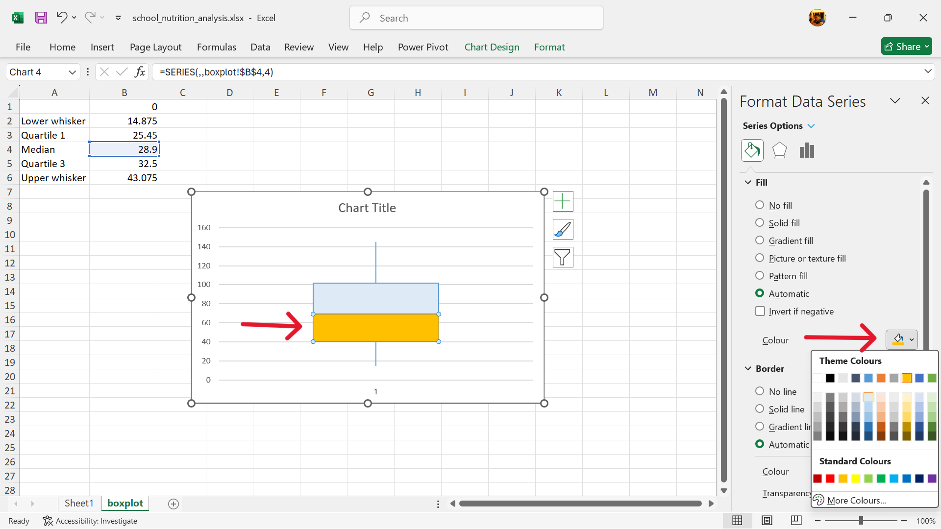
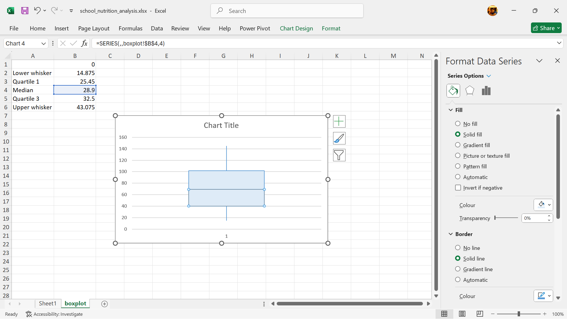
- Change fill and outline colours of the box.
- Boxplot is now created.
*Based on Microsoft Support documentation
Interpreting boxplots
The median, represented by the line within the box, indicates the central value of the data. The height of the box and the length of the whiskers indicate the spread and variability of the data. A wider box or longer whiskers suggest greater variability. The position of the median line within the box can suggest whether the data is symmetrical, skewed left (negative skew), or skewed right (positive skew). Outliers represent data points that are significantly different from the rest of the data and may warrant further investigation. Comparing box plots for different datasets can help reveal differences in their central tendency, spread, and distribution.
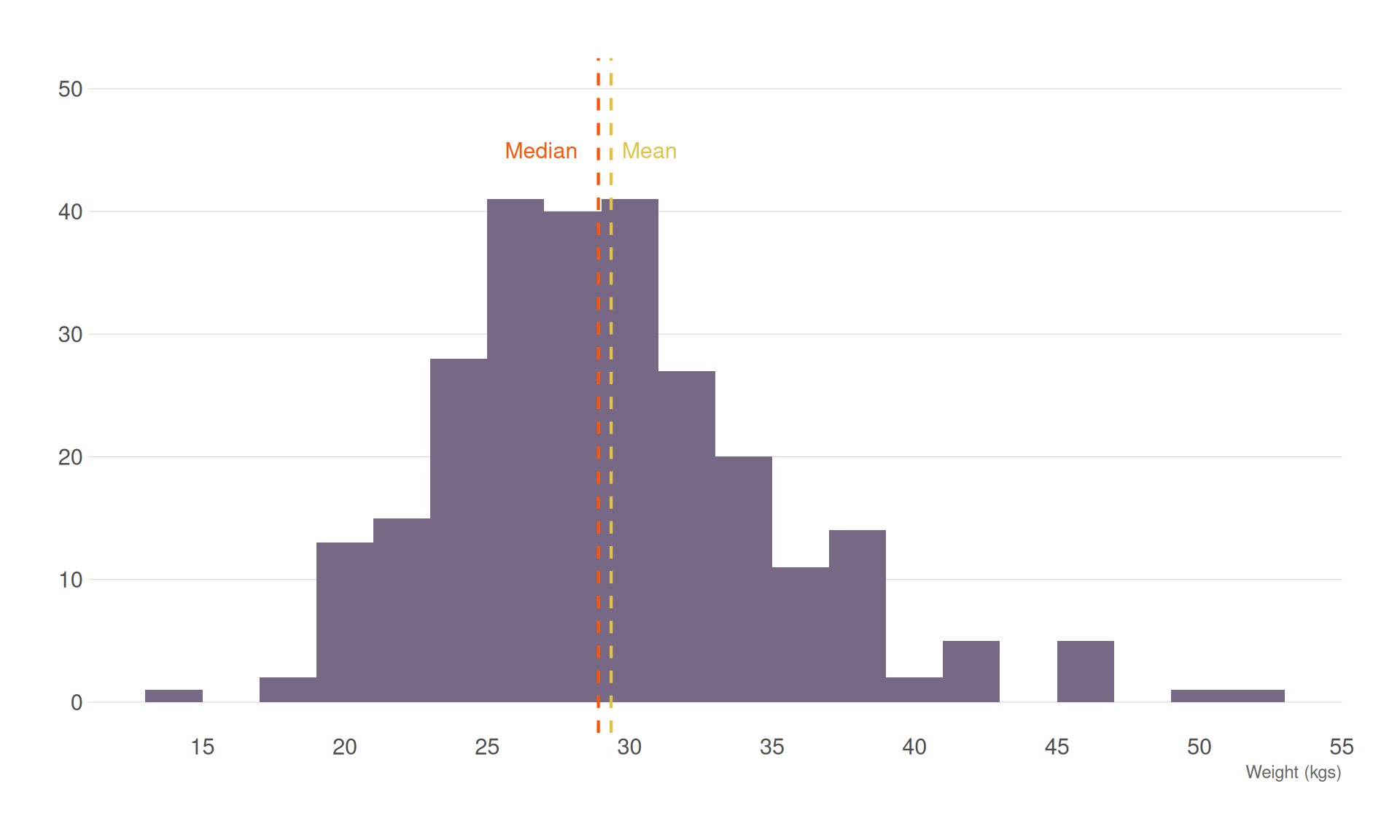
Assessing distribution using histograms
A histogram is a graphical representation that displays the distribution of numerical data. It uses adjacent bars to show the frequency or count of data points within specified ranges, known as bins. Histograms provide insights into the data distribution, such as whether it is normally distributed (bell-shaped), skewed, or has multiple peaks (multimodal). They help identify patterns like clusters, gaps, and outliers in the data.
Plotting the histogram
On a graph, the x-axis (horizontal) represents the bins or intervals of the numerical data. The y-axis (vertical) represents the frequency or count of data points in each bin. Bars are drawn adjacent to each other without gaps, as the bins represent continuous ranges.
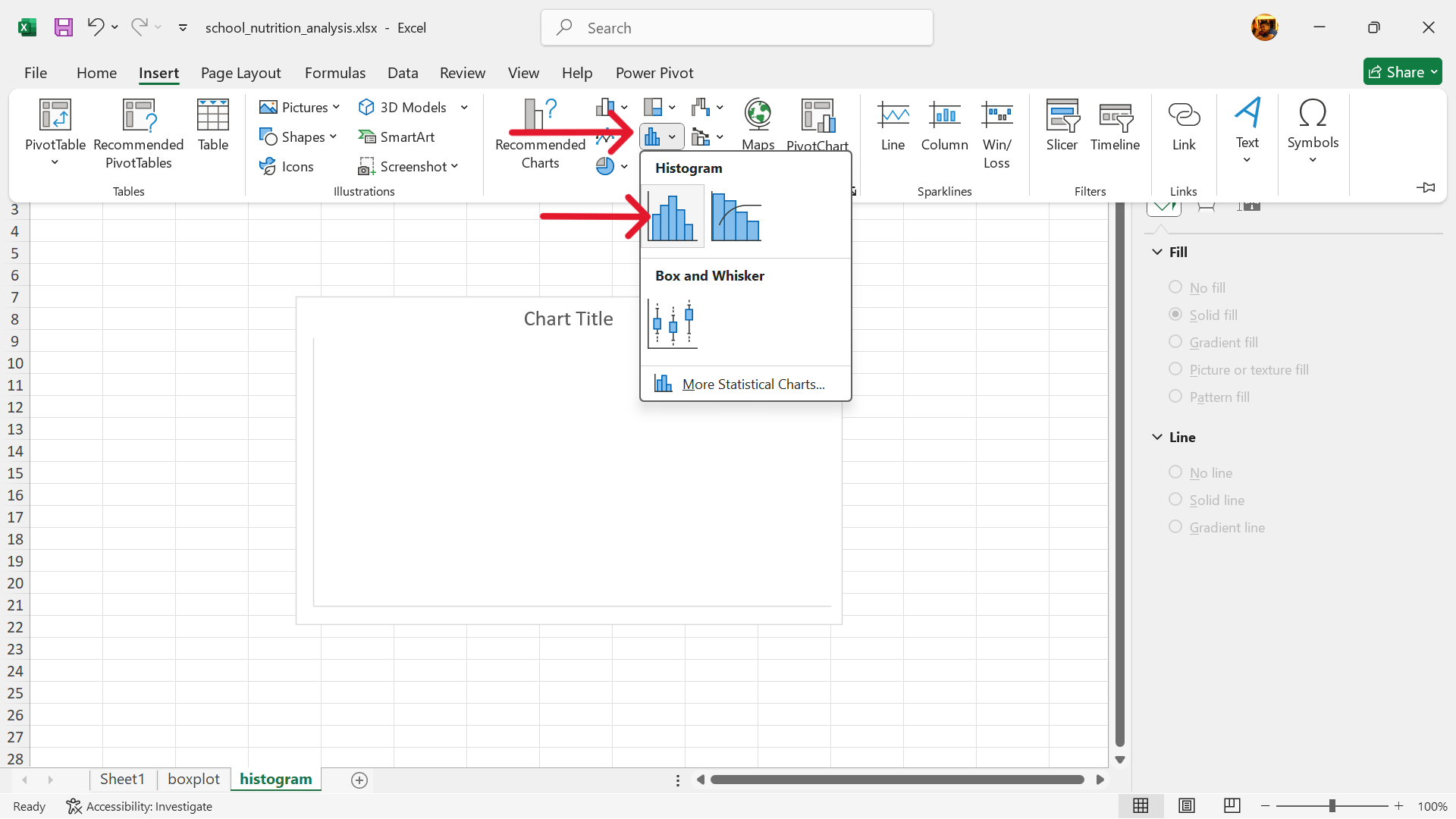
In Excel, the histogram can be plotted as follows:
- Create a base histogram plot.
Go to Insert –> Insert Statistics Chart –> Histogram
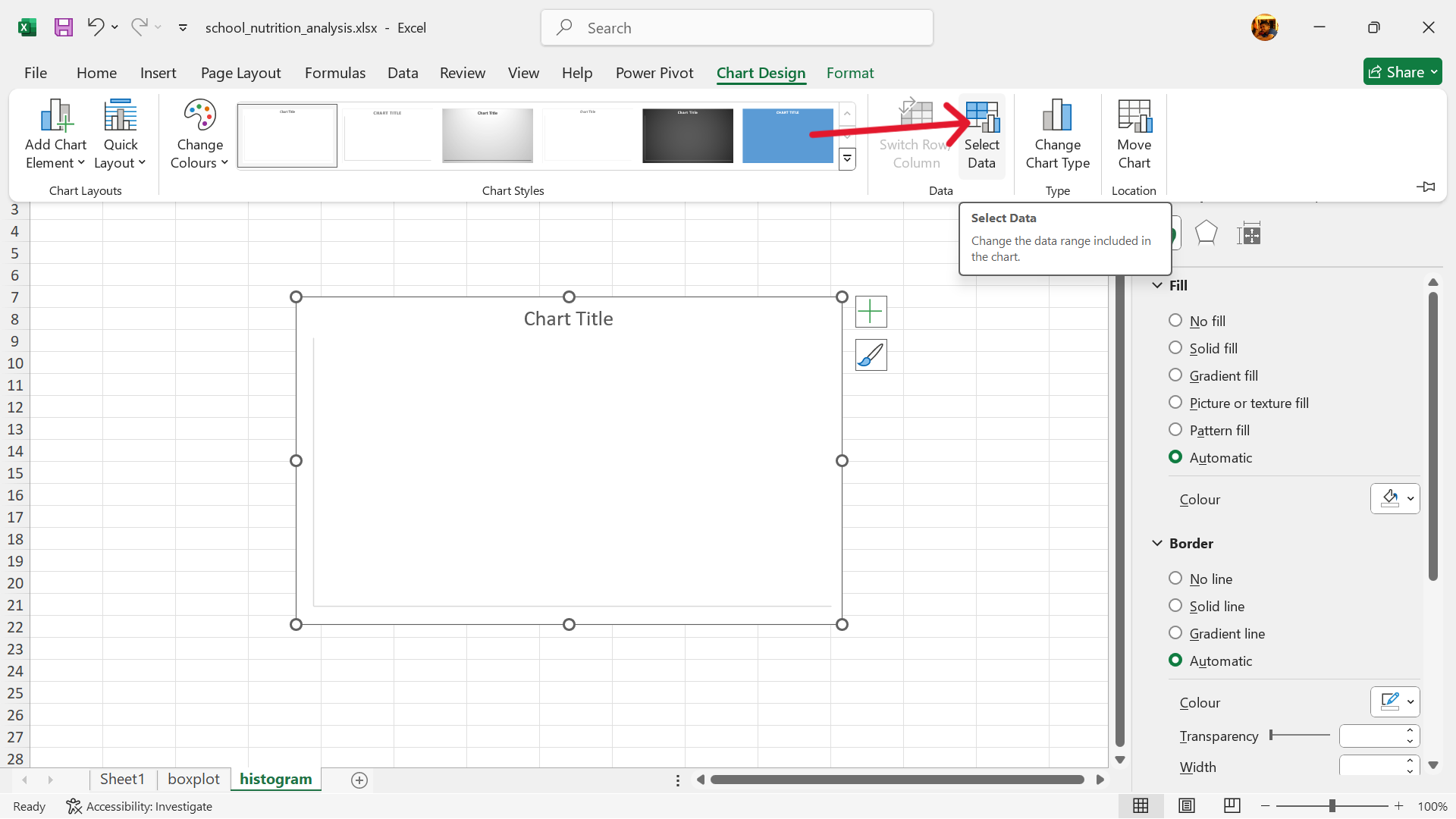
- Select data to use for histogram.
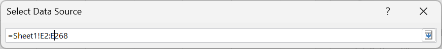
Select base chart –> Chart Design –> Select Data
- Edit range of values to use for histogram.
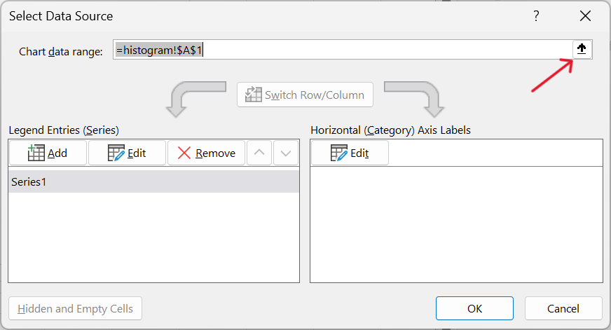
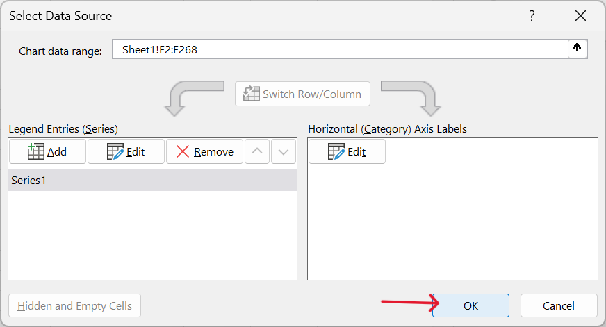
- Confirm range of values to use for histogram.
Click on OK
- Histogram is now created.
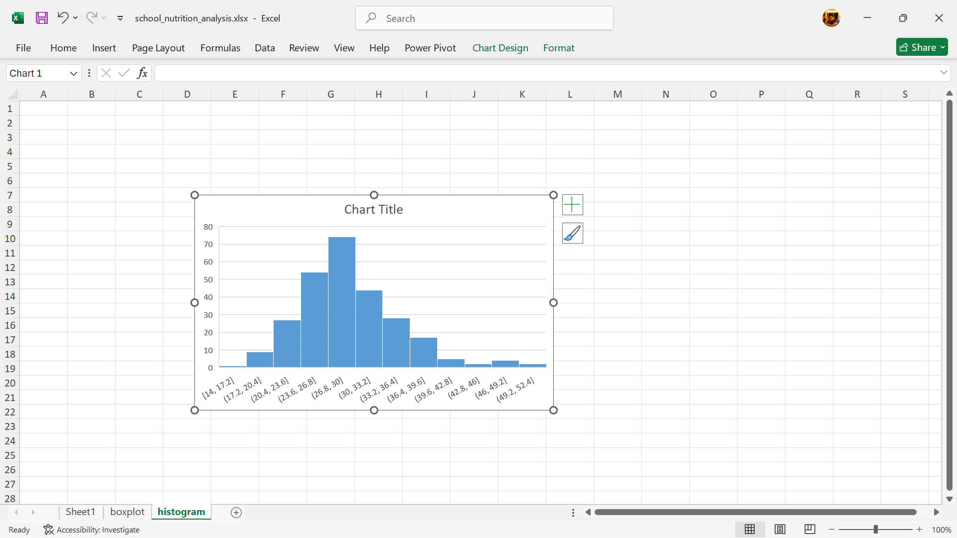
Interpretation
Histograms provide insights into the data distribution, such as whether it is normally distributed (bell-shaped), skewed, or has multiple peaks (multimodal). Histograms help identify patterns like clusters, gaps, and outliers in the data.
Assessing distribution using QQ plots
A QQ plot, or Quantile-Quantile plot, is a graphical tool used to assess whether a dataset follows a specific theoretical distribution (like a normal distribution) or to compare the distributions of two datasets. It does this by plotting the quantiles of the observed data against the quantiles of the theoretical distribution (or the other dataset).
Plotting QQ plots to test for normality
There is no built-in chart for QQ plots in Excel. To create a QQ plot to test normal distribution in Excel, we recommend creating a new worksheet and then importing the raw dataset into this worksheet before proceeding with the steps below. We use the school nutrition dataset for this demonstration.
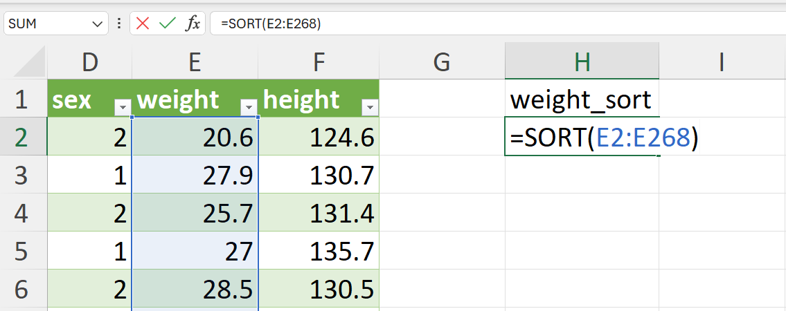
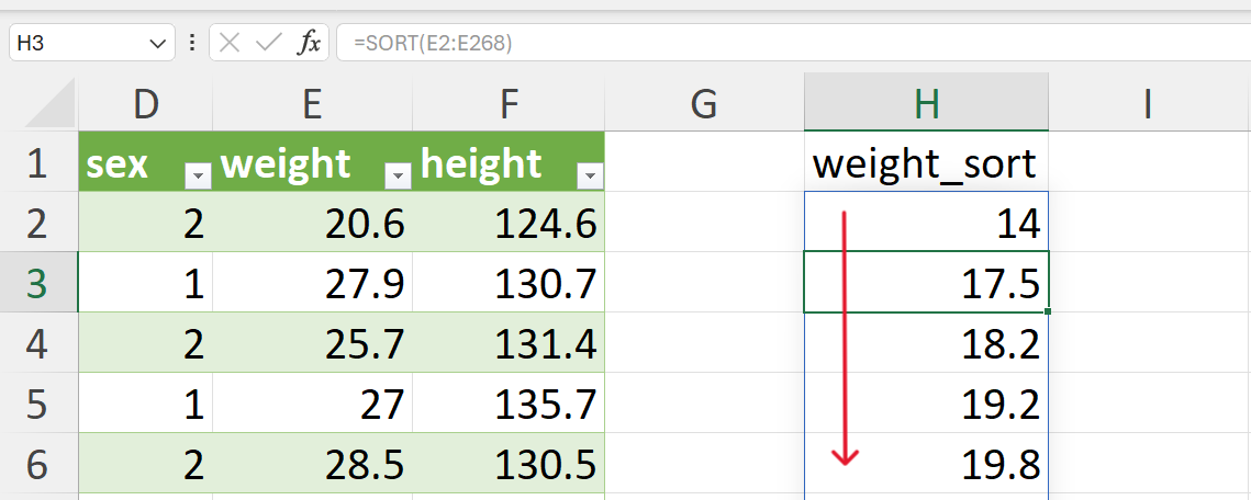
- Sort weight values in ascending order.
We recommend doing this step on the worksheet where the data is and create a new variable for the sorted values of weight. The values can be sorted using the SORT() function in Excel as follows (Figure 20.40):
=SORT(E2:E268)This function will fill the new column/variable with the weight values sorted in ascending order without changing the order of the reference/original data. We recommend doing it this way instead of sorting the whole dataset based on weight so that you can perform the same operation for creating QQ plots for other appropriate variable in the dataset (i.e., height).
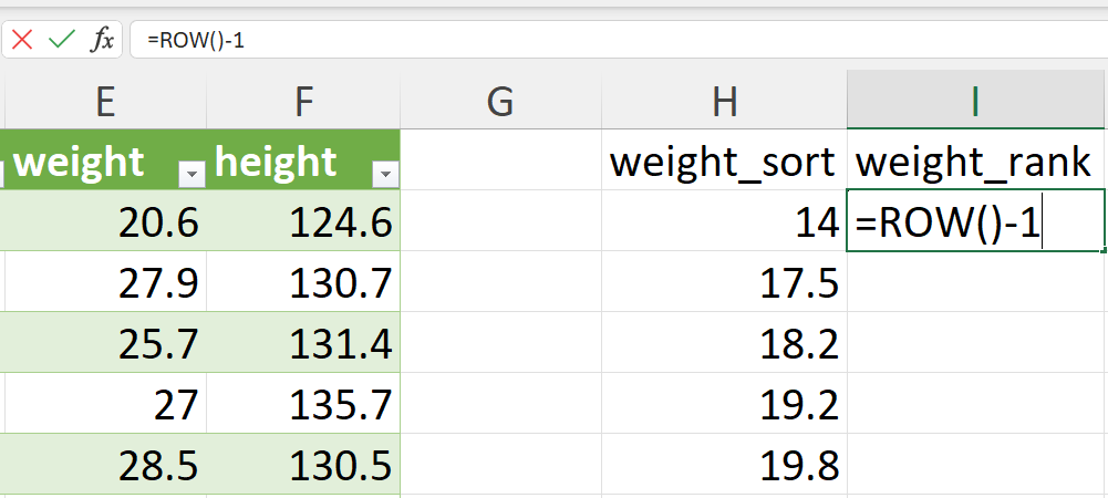
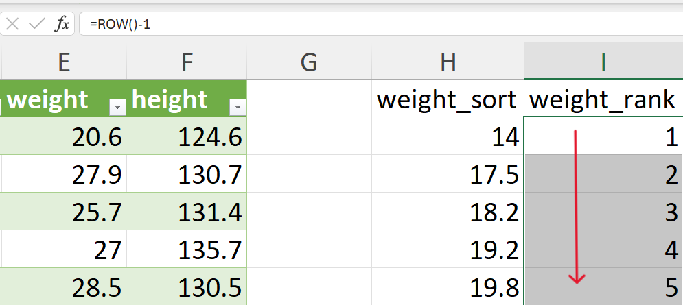
- Give a rank to each value from 1 to the total number of rows.
This should be created in a new column/variable. This can be done easily using the following formula (Figure 20.42):
=ROW() - 1Copy or drag this formula from the first cell to the following cells in the new column/variable to get the rank for all weight records (Figure 20.43).
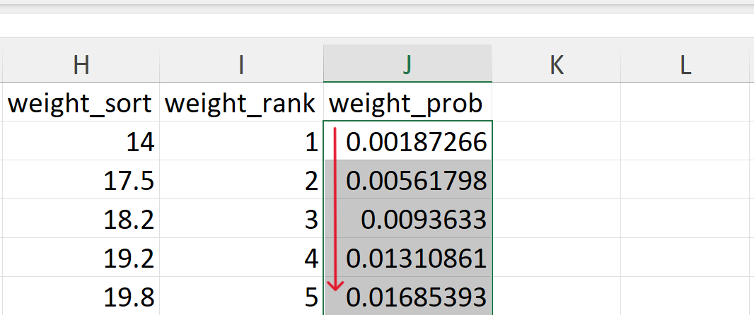
- Calculate the empirical/observed cumulative probabilities.
The empirical cumulative probabilities are calculated as follows:
\[ F(x) ~ = ~ \frac{rank - 0.5}{n} \]
where:
\(rank ~ = ~ \text{rank of the sorted value of the variable}\)
\(n ~ = ~ \text{number of records/values of the variable}\)
In Excel, it can be calculated as follows (Figure 20.44):
=(I2-0.5)/COUNT($I$2:$I$268)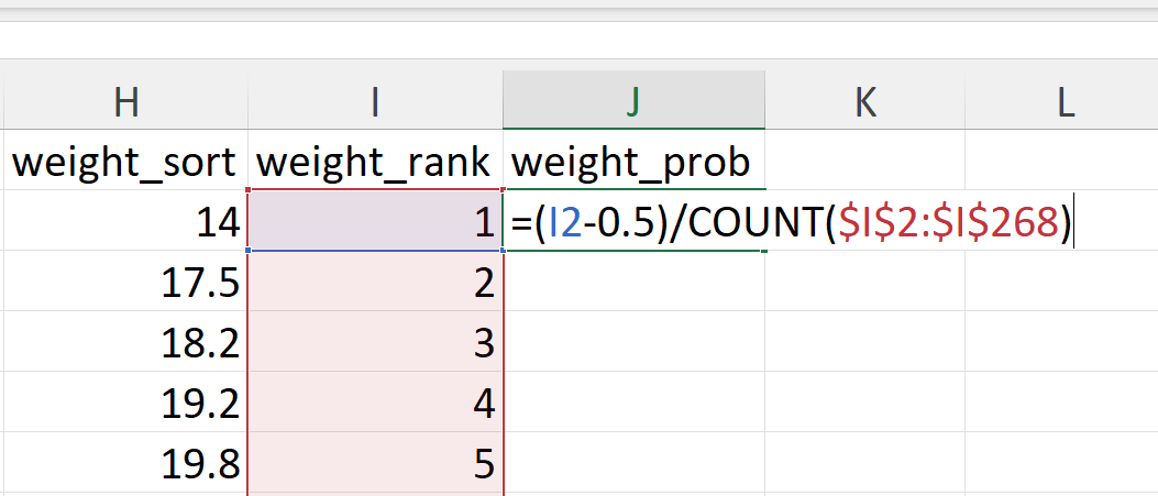
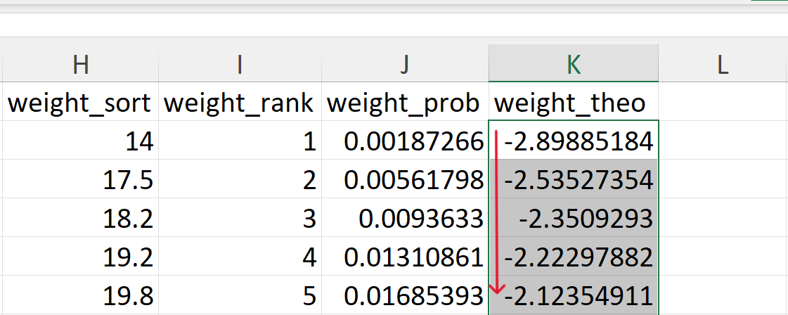
- Calculate the theoretical quantiles.
The theoretical quantiles for each of the empirical probabilities are calculated as follows:
\[ q ~ = ~ F^{-1} \times p \]
where:
\(q ~ = ~ \text{theoretical quantile}\)
\(F^{-1} ~ = ~ \text{inverse of the cumulative distribution function}\)
\(p ~ = ~ \text{cumulative probability}\)
In Excel, it can be calculated as follows (Figure 20.46):
=NORM.S.INV(J2)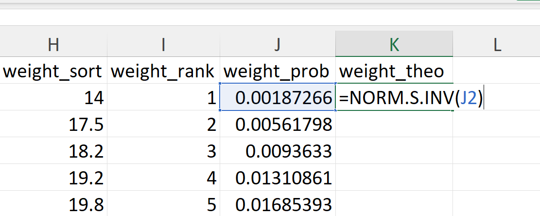
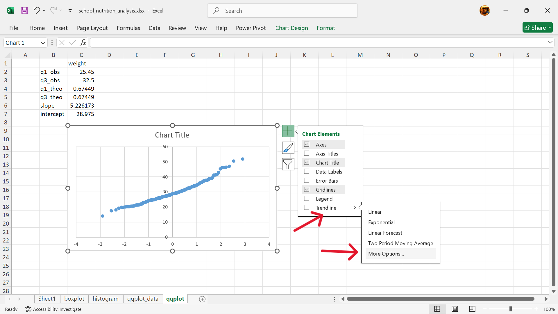
- Calculate the slope and intercept of the line of agreement (QQ line).
In a QQ (quantile-quantile) plot, the line of agreement, also known as the 45-degree line or reference line, represents the expected relationship if two datasets being compared have identical distributions. If the points on the QQ plot fall close to this line, it suggests the distributions are similar. Deviations from the line indicate differences in the distributions.
We recommend creating a new worksheet for these calculations (Figure 20.48) and then creating layout in which the various values can be calculated as shown in Figure 20.49.
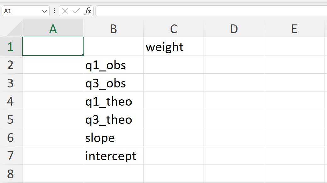
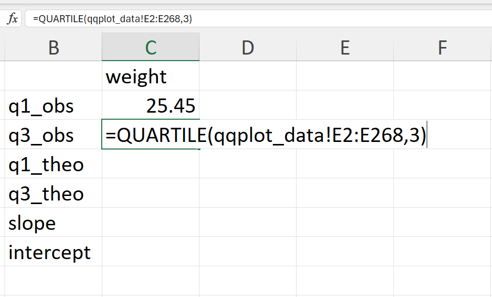
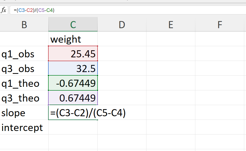
- Calculate the empirical 25% and 75% quantiles of the weight values (Figure 20.50).
In Excel, these can be calculated as follows:
=QUARTILE(qqplot_data!E2:E268,1)     ## 25% quantile
=QUARTILE(qqplot_data!E2:E268,3)     ## 75% quantile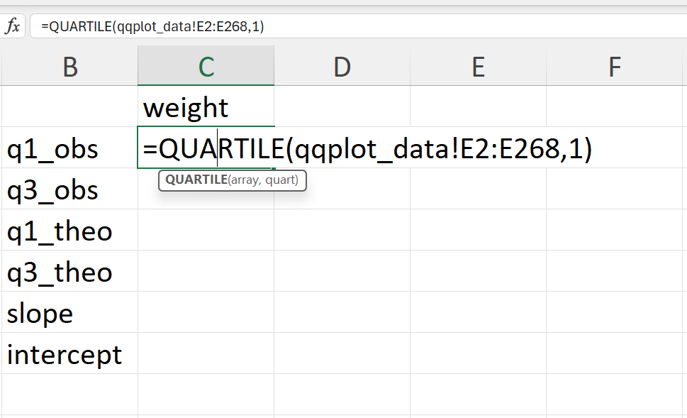
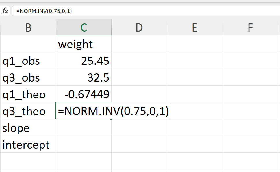
- Calculate the theoretical 25% and 75% quantile of the normal distribution (Figure 20.52).
In Excel, these can be calculated as follows:
=NORM.INV(0.25,0,1)     ## 25% quantile
=NORM.INV(0.75,0,1)     ## 75% quantile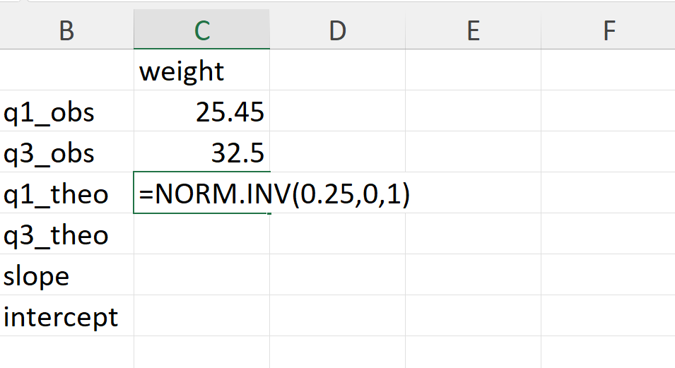
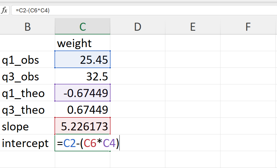
- Calculate the slope and intercept of the QQ line.
The slope of the QQ line is calculated as follows:
\[ slope ~ = ~ \frac{q75_{observed} - q25_{observed}}{q75_{theoretical} - q25_{theoretical}} \]
The intercept of the QQ line is calculated as follows:
\[ intercept ~ = ~ q25_{observed} - slope \times q25_{theoretical} \]
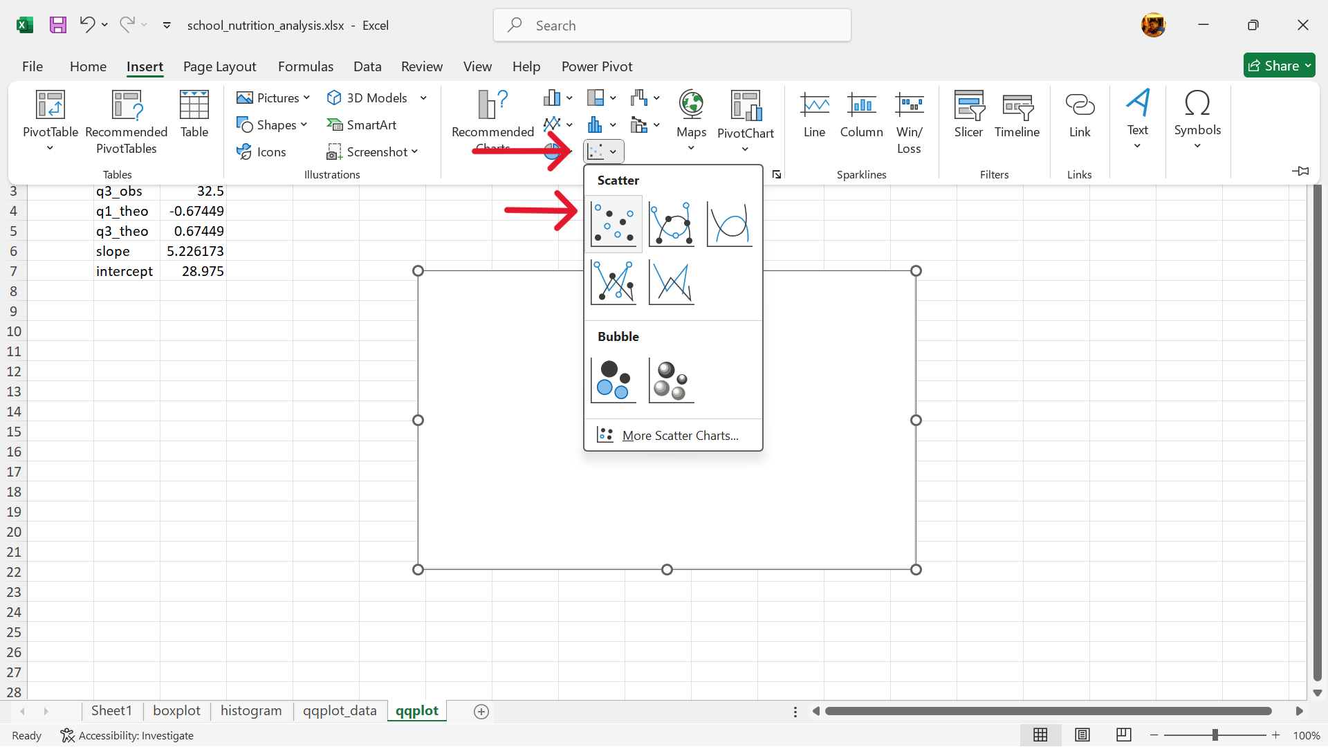
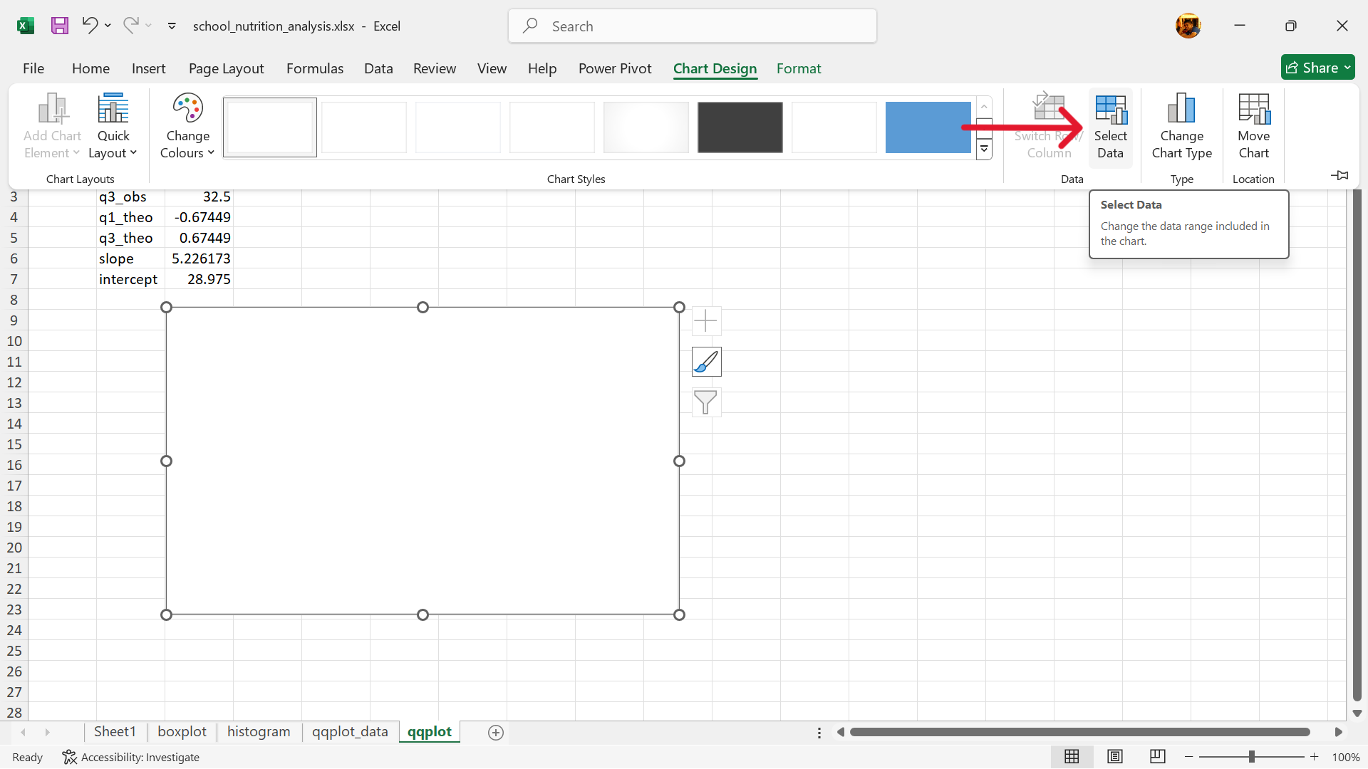
- Create a base scatter plot.
In the same worksheet as the calculations, create a base scatter plot as follows (Figure 20.56):
Insert –> Charts –> Insert Scatter (x, Y) or Bubble Chart –> Scatter
- Select data to use for scatter plot.
Select base chart –> Chart Design –> Select Data
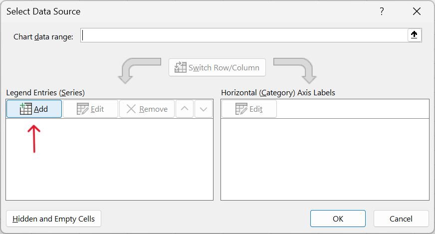
- Add a data series to base scatter plot.
Click on Add (Figure 20.58)
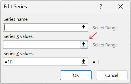
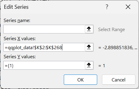
- Specify values for x-axis of the scatter plot.
The x-axis should use the range of values for the theoretical probabilities.
- Specify values for y-axis of the scatter plot.
The y-axis should use the range of values for the ordered values for weight.
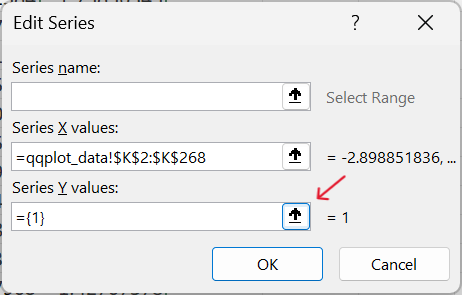
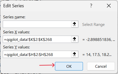
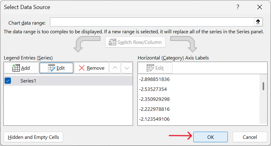
- Confirm selection of values for scatter plot.
- Add the QQ line to the QQ plot.
Chart Elements –> Trendline –> More Options...
Select Linear for trendline and tick Set Intercept and then input the value for intercept that we calculated earlier (Figure 20.65).
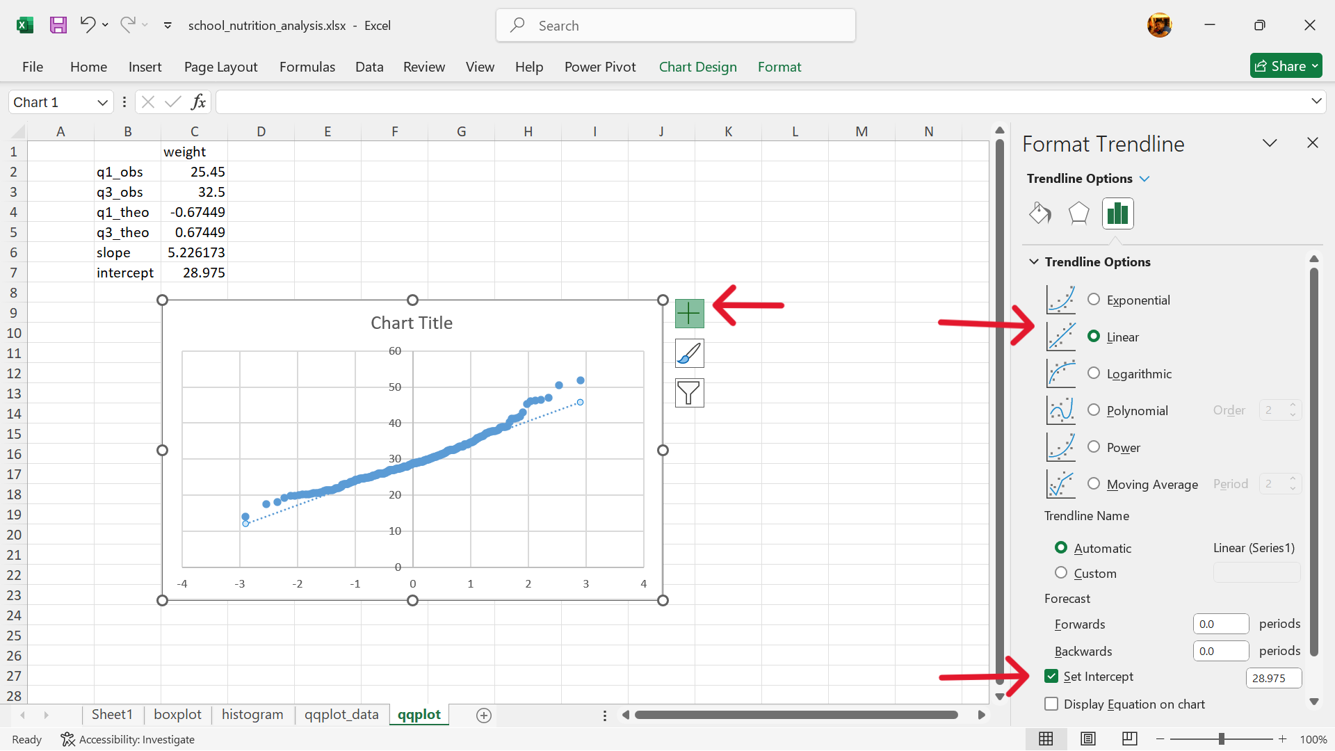
Interpreting the plot
If the data follows the theoretical distribution, the points in the QQ plot will roughly form a straight diagonal line. Deviations from this line indicate that the data does not follow the theoretical distribution, and the nature of the deviations can provide insights into how the data differs from the expected distribution (e.g., skewness, outliers). In simpler terms: A QQ plot is a visual check to see if your data “looks like” it came from a specific distribution. It helps you determine if your data is normally distributed, or if it has some other pattern.
20.1.4 Age Heaping
Age heaping is the tendency to report children’s ages to the nearest year or adults’ ages to the nearest multiple of five or ten years. Age heaping is very common that is why most reported national statistics use broad age groups.
Testing for age heaping
There is no built-in function in Excel that tests for age heaping. The following steps can be performed in Excel to test whether there is significant age heaping in a dataset with age values. These steps use the school nutrition data for demonstration. We recommend that these steps be done in a separate worksheet from the raw data to avoid contamination of original dataset.
- Determine an appropriate divisor.
The school nutrition data records age in months. A useful way of looking at age heaping when age is recorded in months is to examine the remainders when the ages are divided by 12. So, we set the divisor to 12.
- Create a new variable for the remainder when age variable is divided by 12.
Create a new worksheet containing the raw dataset and create a new variable as shown in Figure 20.66.
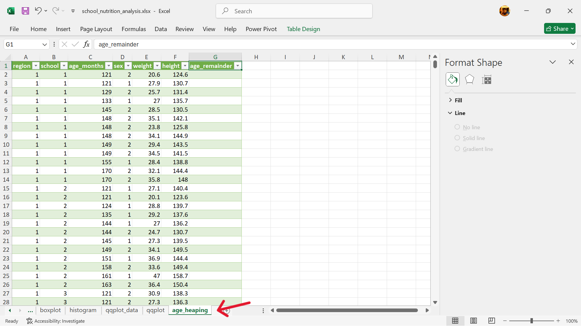
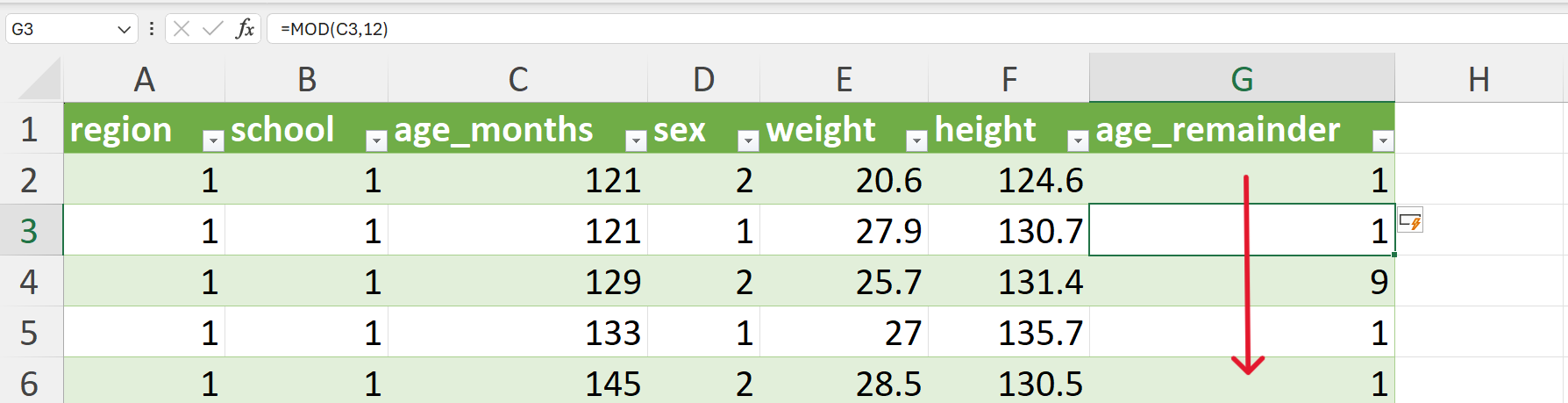
Apply the modulo operator to the age variable using 12 as the divisor. This can be done using the MOD() function is Excel as follows (Figure 20.67):
=MOD(C2,12)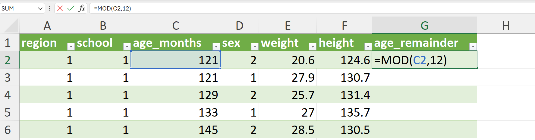
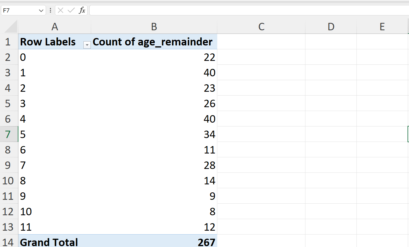
- Create a summary table of the counts per remainder values.
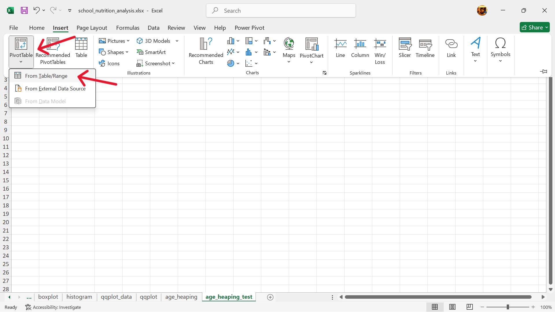
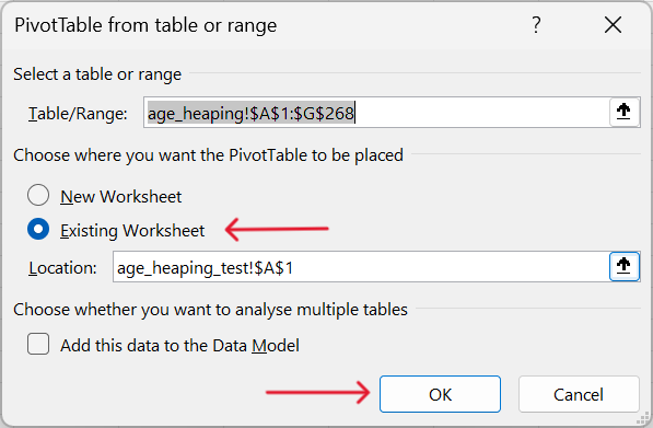
- In a separate worksheet (see Figure 20.69), create a summary table using Excel’s pivot table functionality.
Insert –> Pivot Table –> From table/range
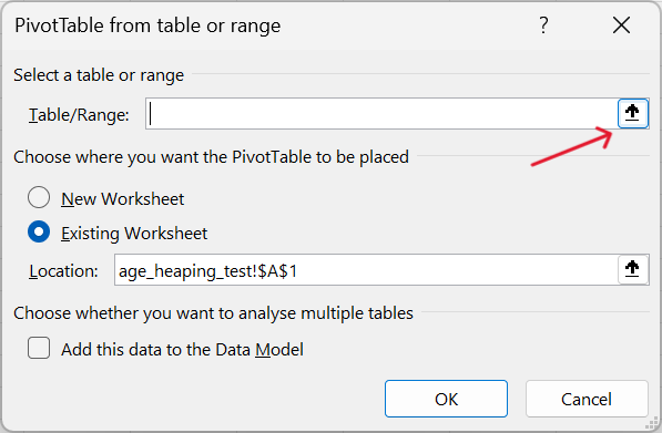
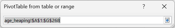
- Select the range of data to summarise via pivot table and insert this pivot table into the new worksheet.
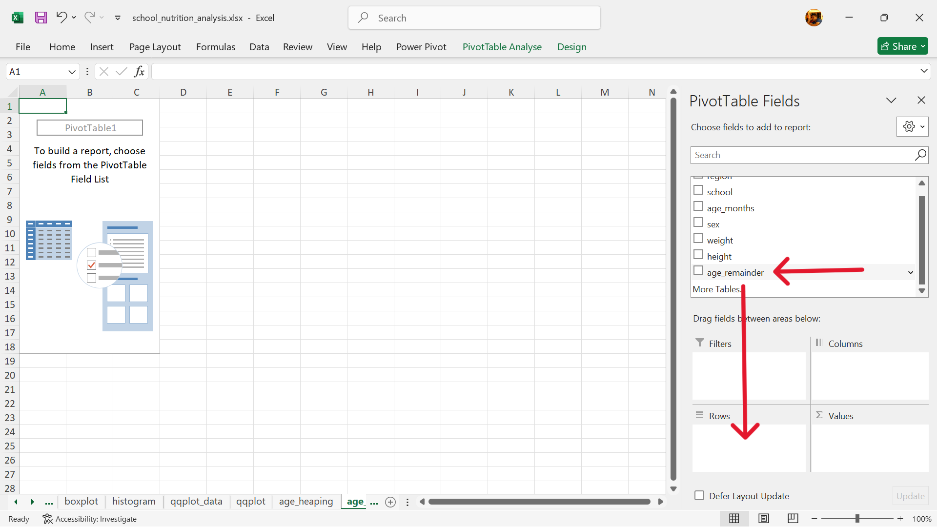
- Select the rows of the summary table.
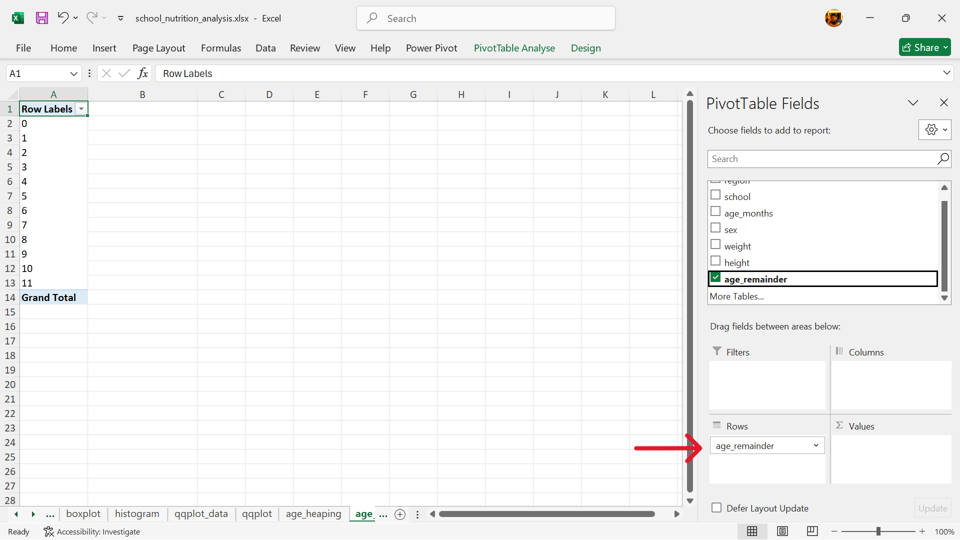
- Select the values of the summary table.
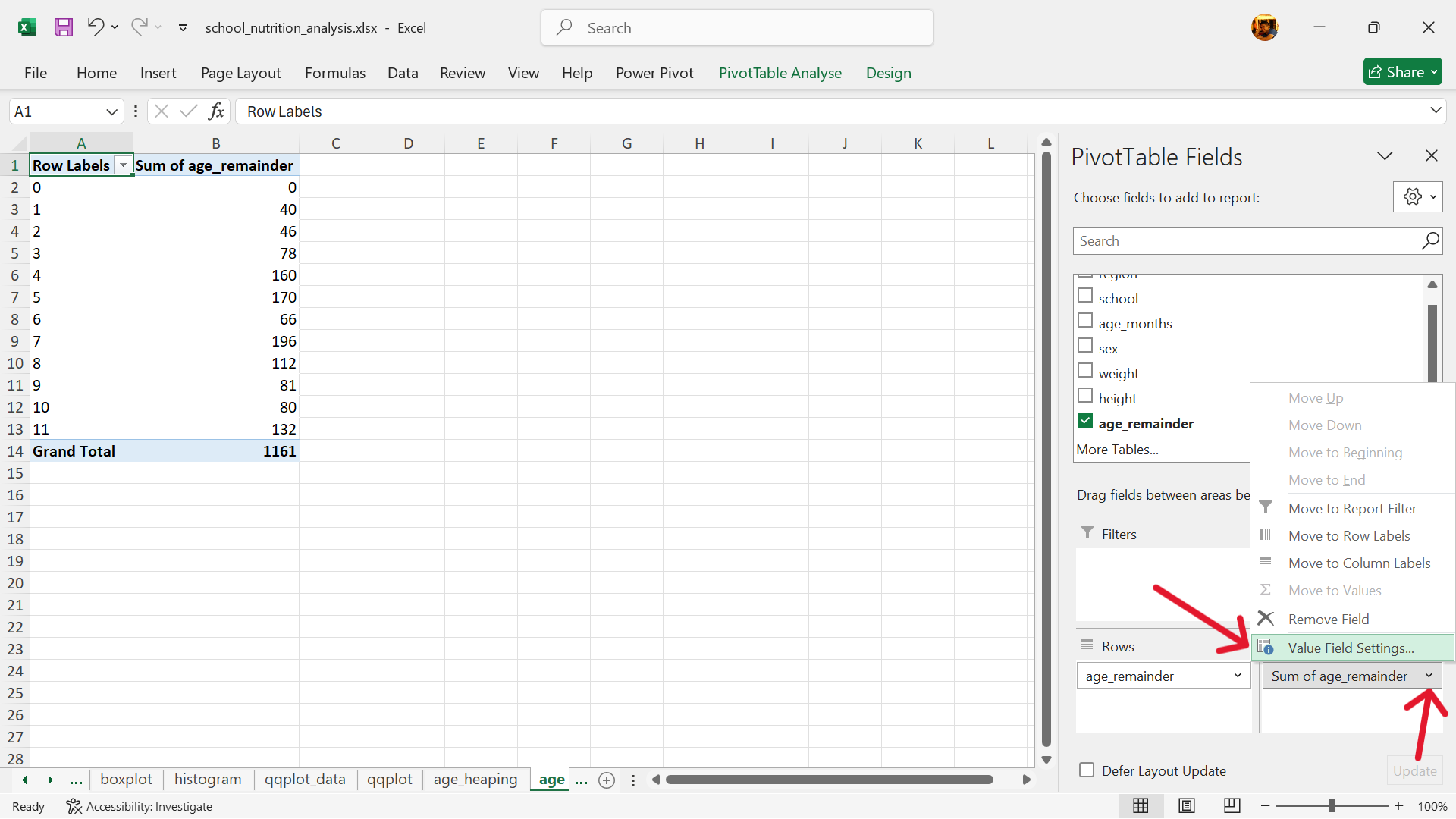
- The summary table is now completed.
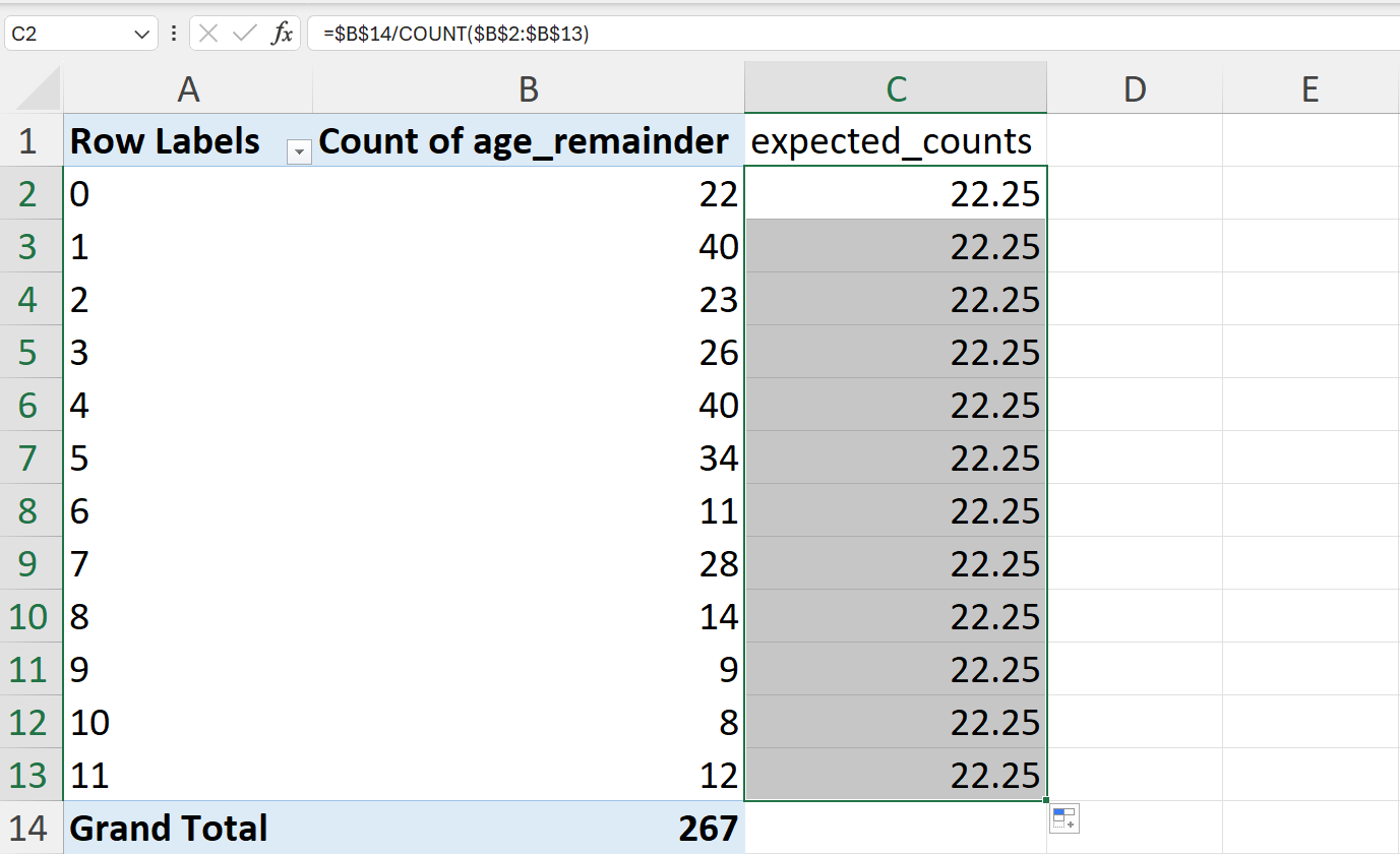
- Calculate the expected counts of the remainder values if there was no age heaping.
The expected counts can be calculated as follows:
\[ \text{expected counts} ~ = ~ \frac{n}{d-1} \]
where:
\(n ~ = ~ \text{number of records}\)
\(d ~ = ~ \text{divisor}\)
In Excel, this can be calculated using the following formula (Figure 20.80):
=$B$14/COUNT($B$2:$B$13)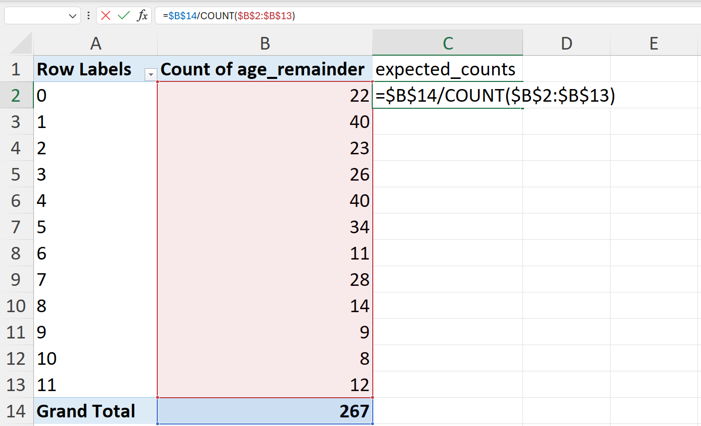
- Perform a chi-square test on the actual vs expected remainder counts.
A chi-square test is performed to test whether the actual remainder values are significantly different from the expected remainder values. This test can be performed in Excel as follows (Figure 20.82):
=CHISQ.TEST(B2:B13,C2:C13)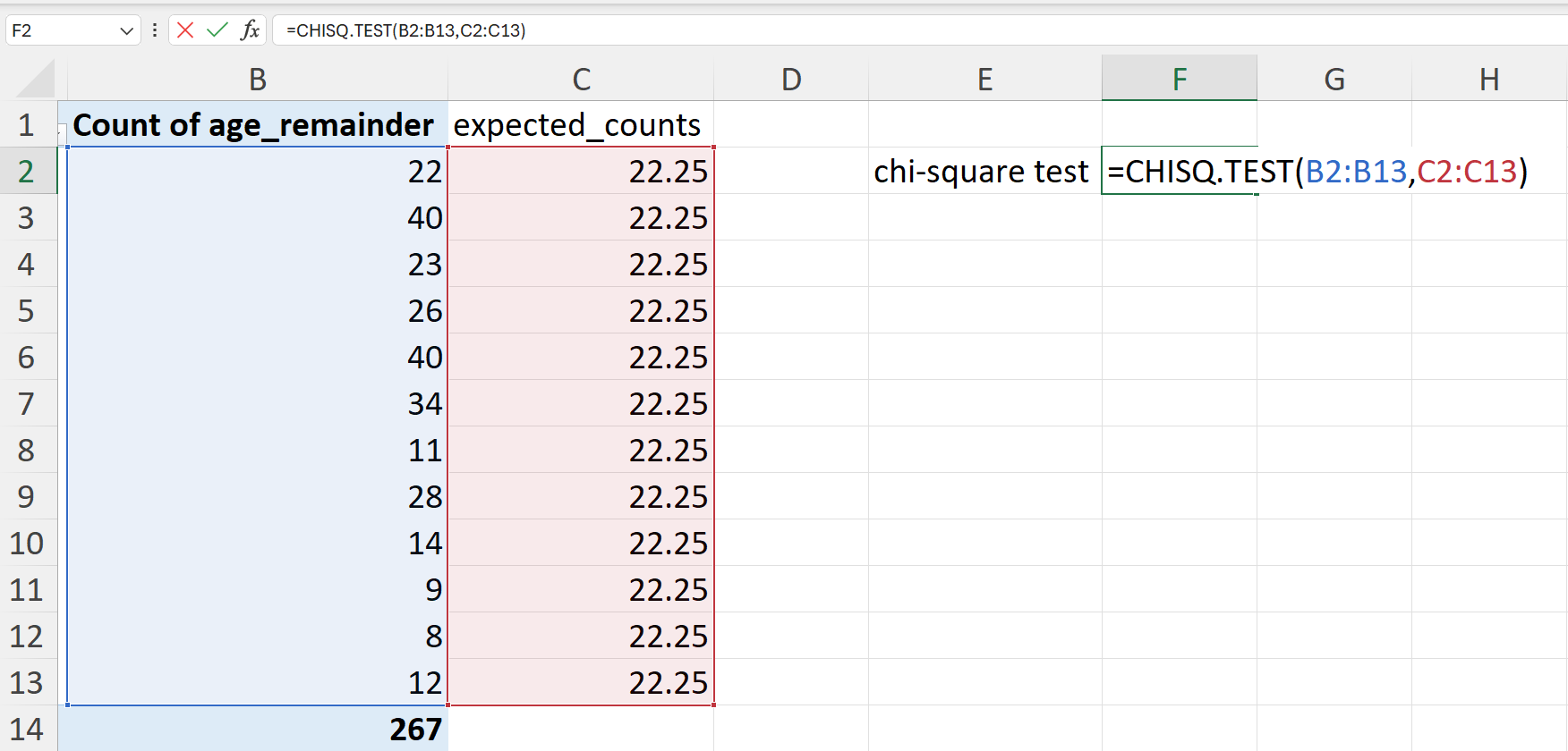
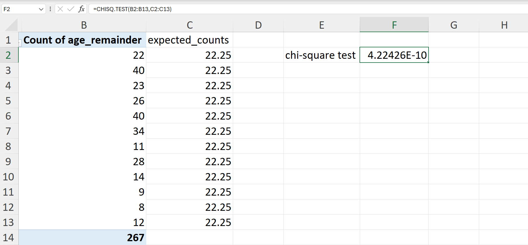
The resulting value when the CHISQ.TEST() is performed in Excel is the p-value of the chi-square test. A p-value of less than 0.05 indicates that there is a significant difference between the actual and expected remainder values for the age in the school nutrition dataset. This points to significant age heaping in the dataset.
20.1.5 Digit preference
Digit preference is the observation that the final number in a measurement occurs with a greater frequency than is expected by chance. This can occur because of rounding, the practice of increasing or decreasing the value in a measurement to the nearest whole or half unit, or because data are made up.
Testing for digit preference
There is no built-in function in Excel that tests for digit preference. The following steps can be performed in Excel to test whether there is significant digit preference in a continuous variable. These steps use the weight variable in the school nutrition data for demonstration. We recommend that these steps be done in a separate worksheet from the raw data to avoid contamination of original dataset.
- Create a new variable for the last digit of the weight variable.
Create a new worksheet and then create a new variable for the last digit of the weight variable as shown in Figure 20.84.
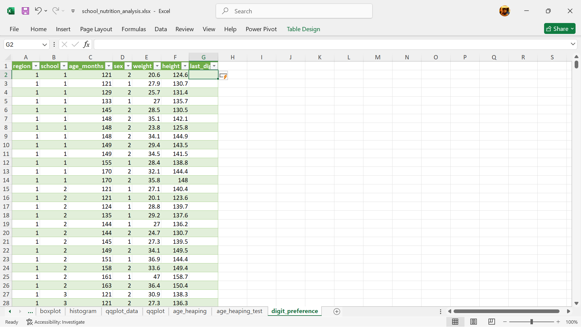
The last digit of the weight variable can be extracted in Excel using the RIGHT() function as follows (see Figure 20.86):
=RIGHT(E2,1)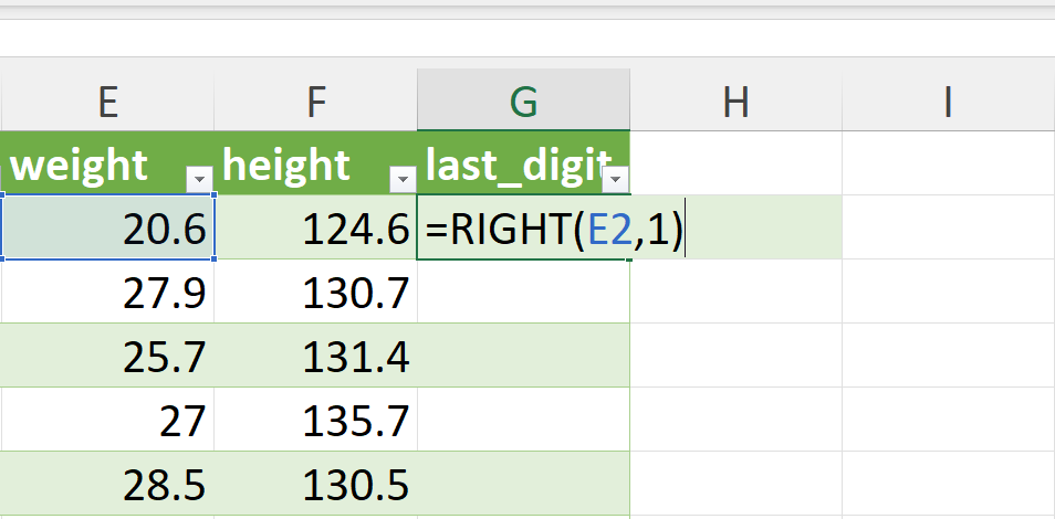
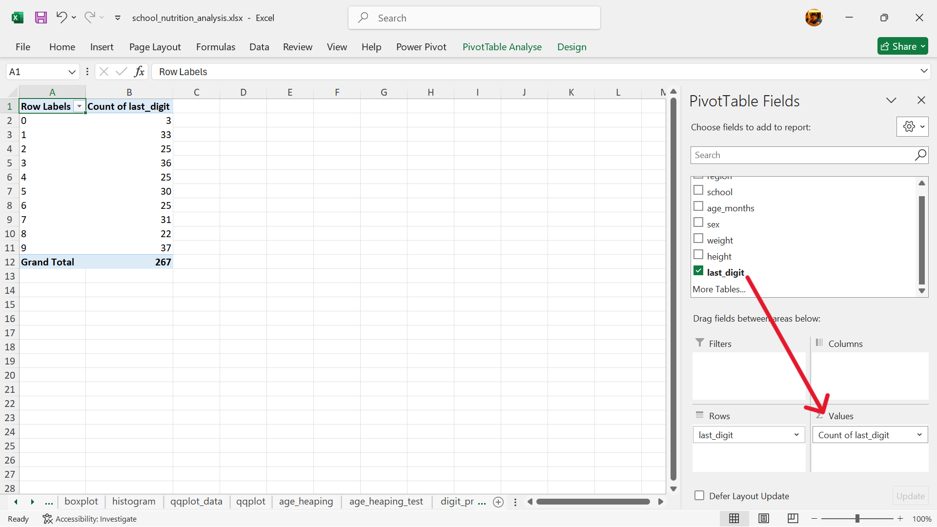
- Create a summary table of the counts of the last digits.
Using pivot table in Excel, create a summary table of the counts of the last digits. We recommend that the summary table be inserted into a new worksheet.
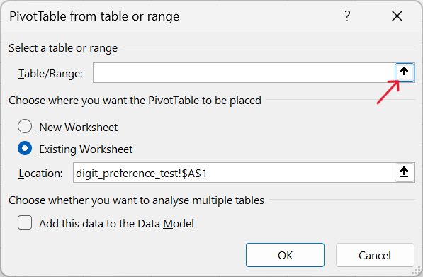
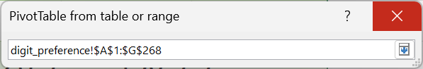
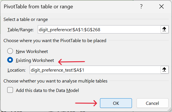
Insert–>Pivot Table–>From Table/Range
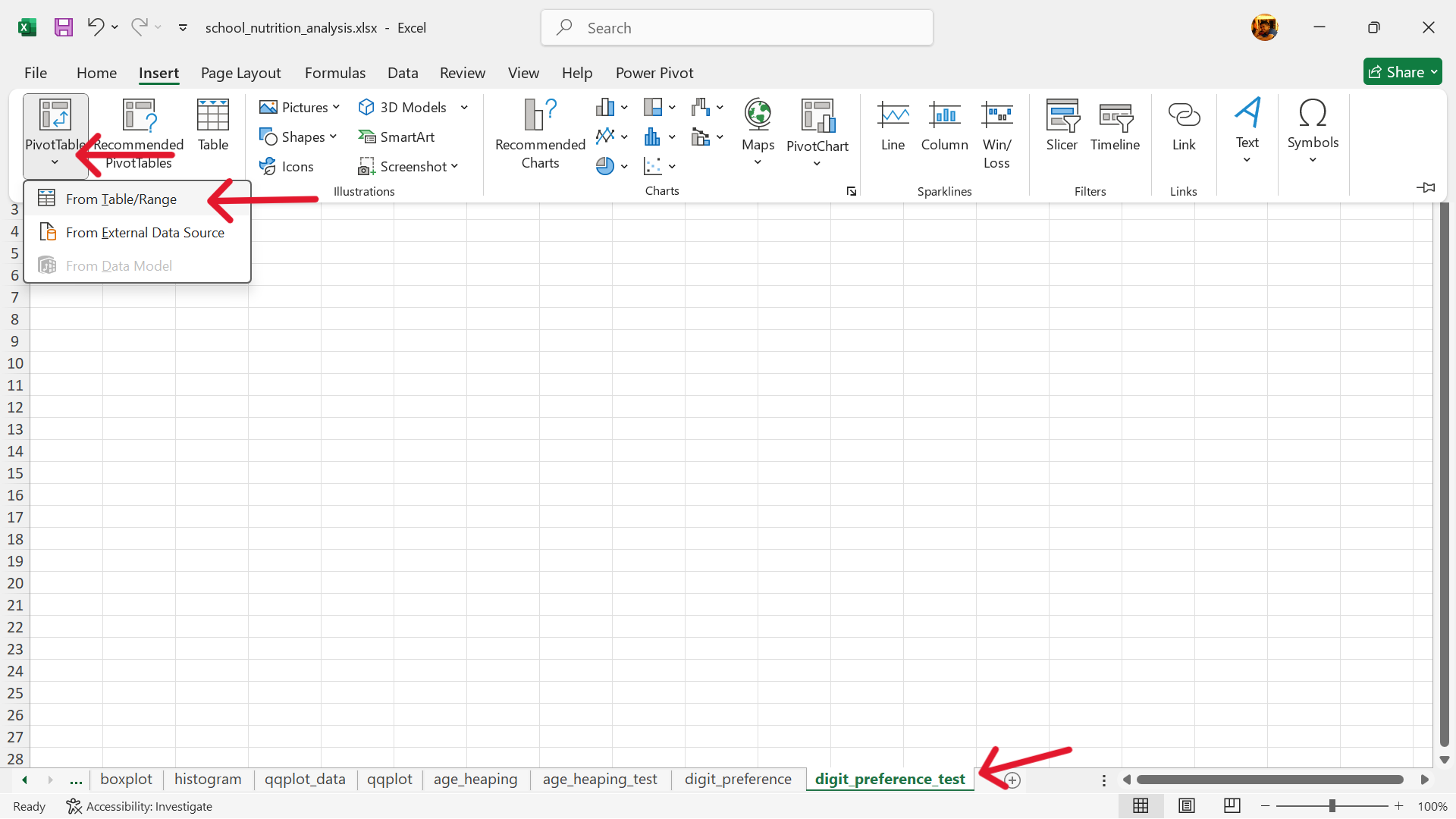
- Select the range of data to summarise via pivot table and insert this pivot table into the new worksheet.
- Select the rows of the summary table.
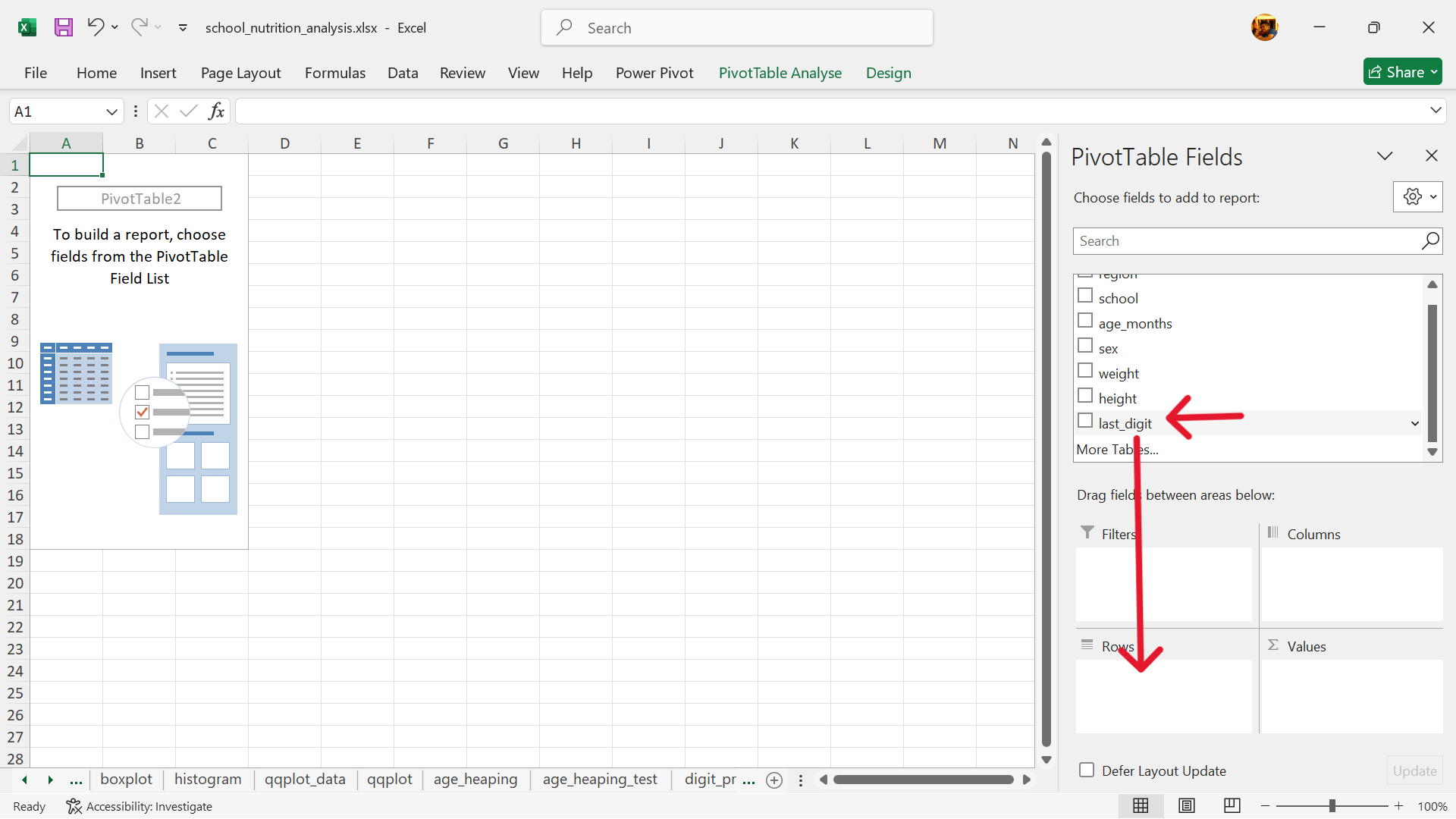
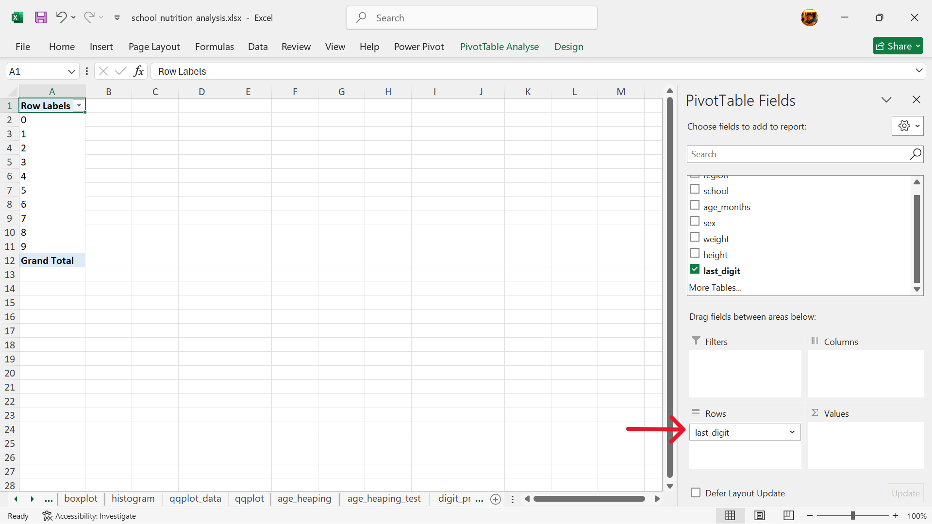
- Select the values of the summary table.
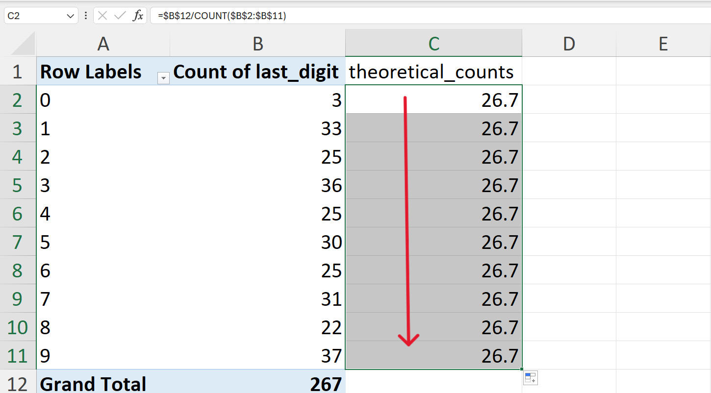
- Calculate the expected counts of the last digits if there was no digit preference.
This can be calculated as:
\[ \text{expected counts} ~ = ~ \frac{n}{10} \]
where:
\(n ~ = ~ \text{number of records}\)
In Excel, this can be calculated as follows (Figure 20.95):
=B12/10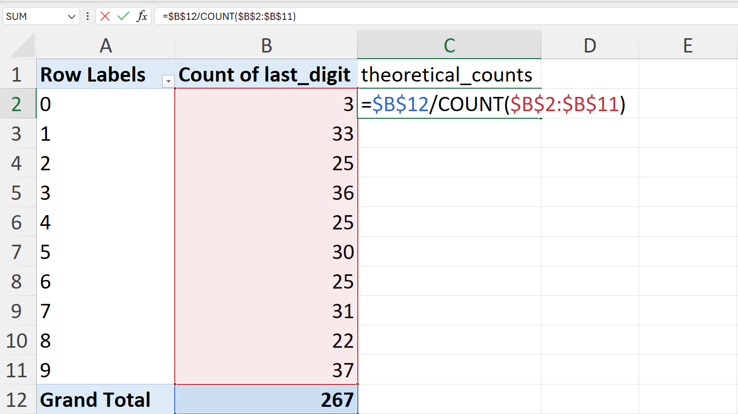
- Calculate the chi-square (\(\chi^2\)) statistic.
The formula to calculate the chi-square (\(\chi^2\)) statistic is:
\[ \chi^2 ~ = ~ \sum^n_{i = 1} \frac{(O_i - E_i) ^ 2}{E_i} \]
In Excel, this can be calculated by first calculating the square of per digit difference in observed and expected counts divided by the expected counts (Figure 20.97).
=((B2-C2) ^ 2) / C2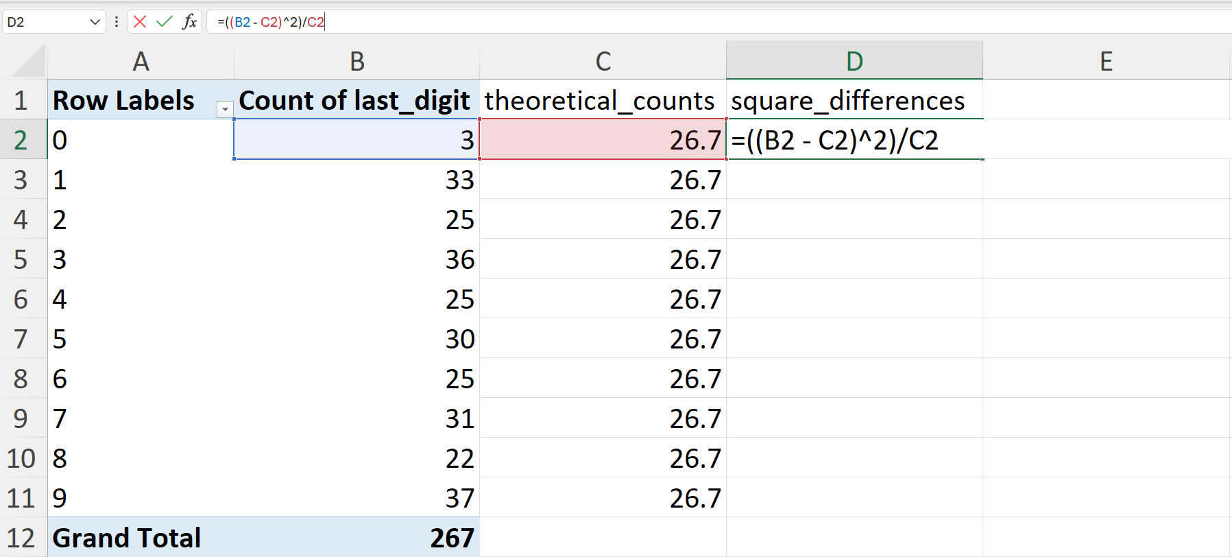
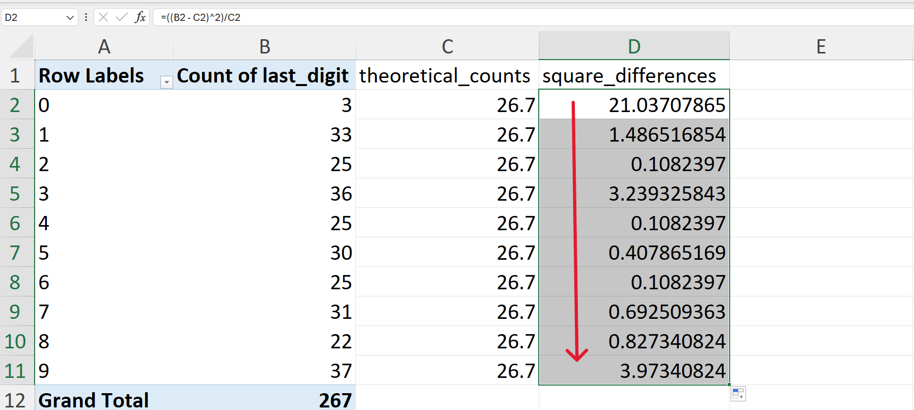
Then, these differences are summed (Figure 20.99).
=SUM(D2:D11)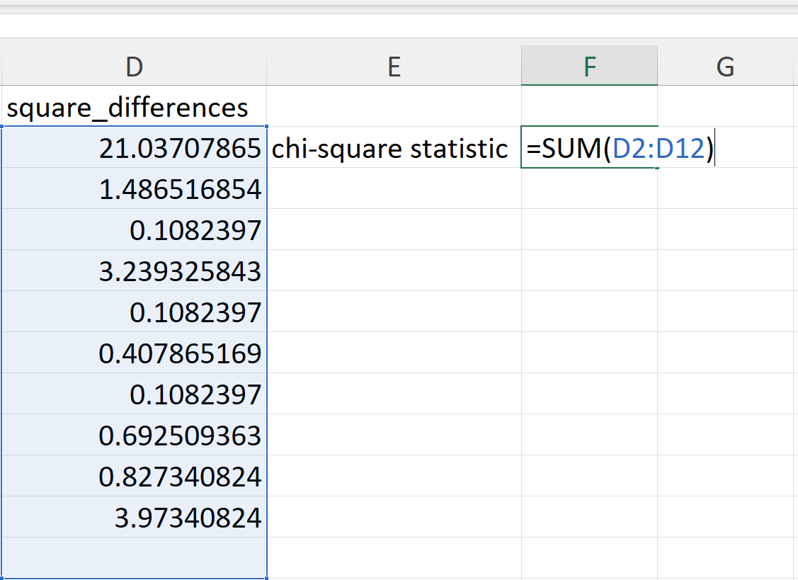
- Calculate the digit preference score (DPS).
The digit preference score (DPS) is a summary measure that reduces the bias in digit preference testing because of sample size. The DPS takes into account sample size as shown in this formula:
\[ DPS ~ = ~ \sqrt{\frac{\chi^2}{\sum^n_{i=1} O_i \times (n_{digits} - 1)}} * 100 \]
In Excel, this can be calculated as follows (Figure 20.100):
=SQRT(F2/(SUM(B2:B11)*(COUNT($B$2:$B$11)-1)))*100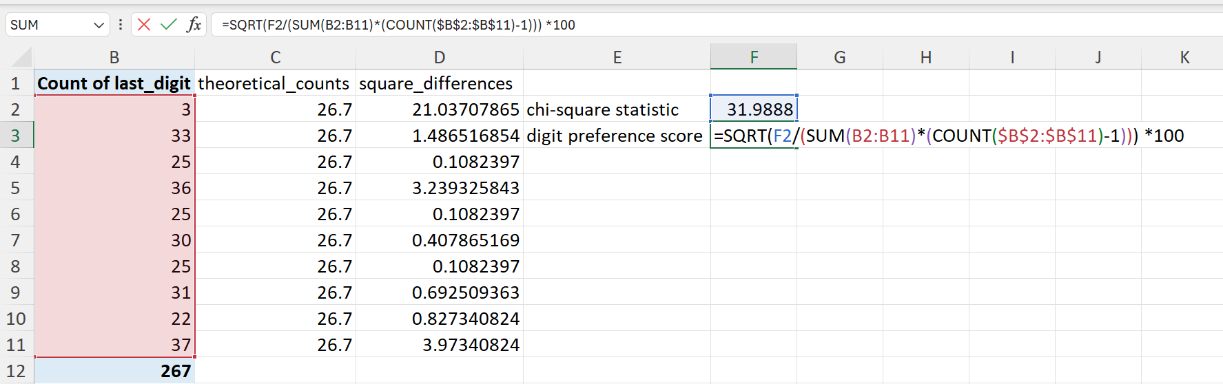
Interpreting the digit preference score
The following table shows how to interpret the DPS.
| DPS | Classification |
|---|---|
| < 8 | Excellent |
| from 8 to < 12 | Good |
| from 12 to < 20 | Acceptable |
| 20 or higher | Problematic |
20.2 Categorical variables
Categorical variables represent attributes or categories instead of numerical values. They organise data into specific groups or labels, and each observation is placed into one group. Categorical variables don’t have an inherent numerical order or ranking. They consist of a finite number of distinct categories or groups.
Categorical variables can be further classified as either nominal, ordinal, or binary.
Nominal - categories with no inherent order such as colours or types of fruit.
Ordinal - categories with a meaningful order such as education level - primary, secondary, college.
Binary - a special case of categorical variable with only two categories such as yes or no.
20.2.1 Some considerations when dealing with categorical variables
Use the inherent order of ordinal variables
Order nominal variables meaningfully
Use colours for categories appropriately